Back to all projects
Career Pathfinder
UX Design, Visual Design, User Research
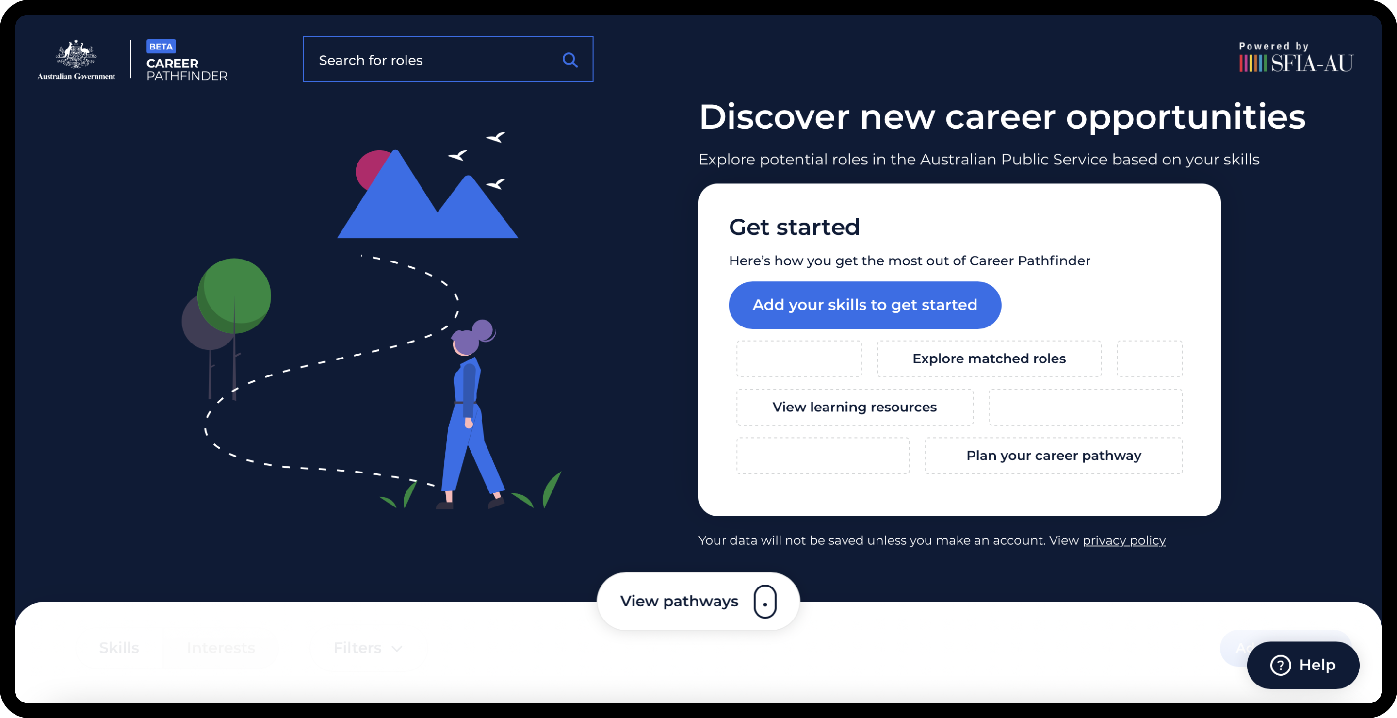
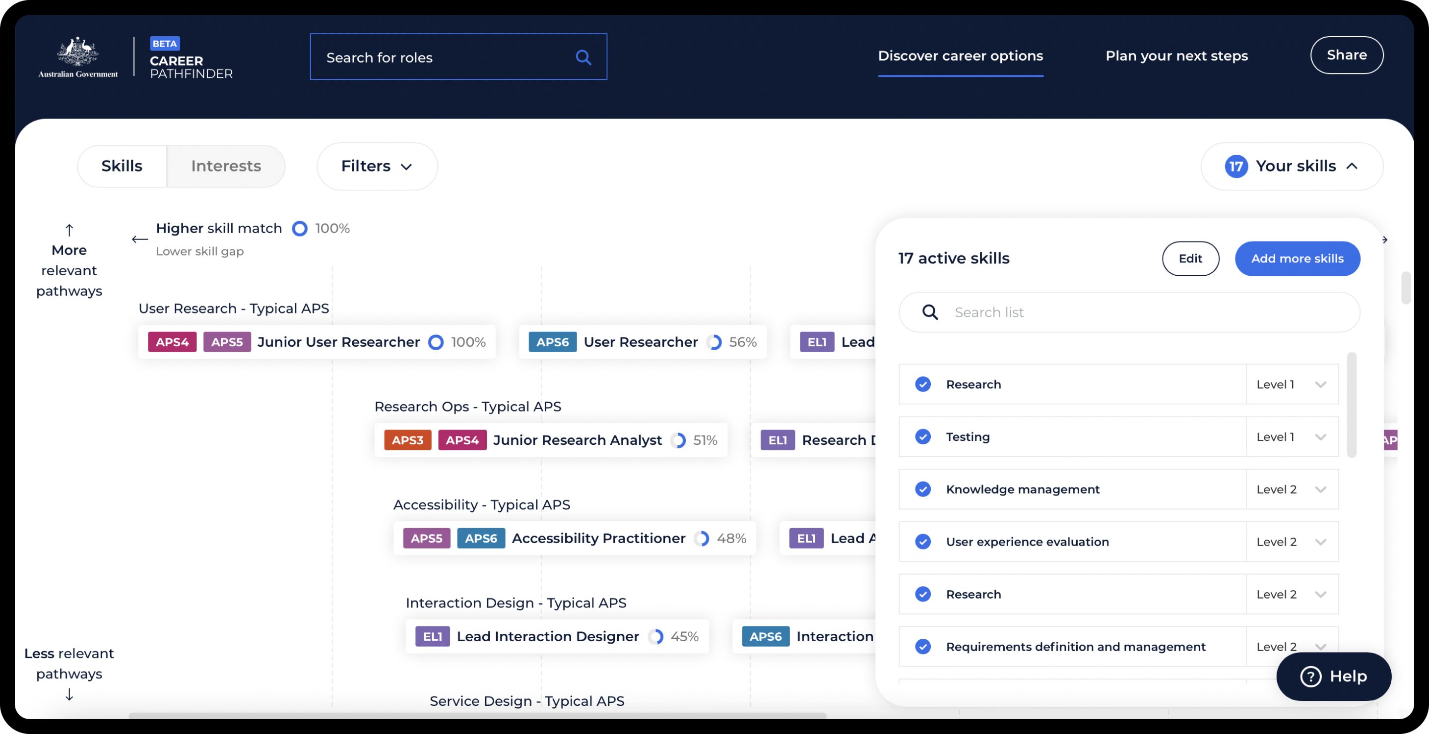
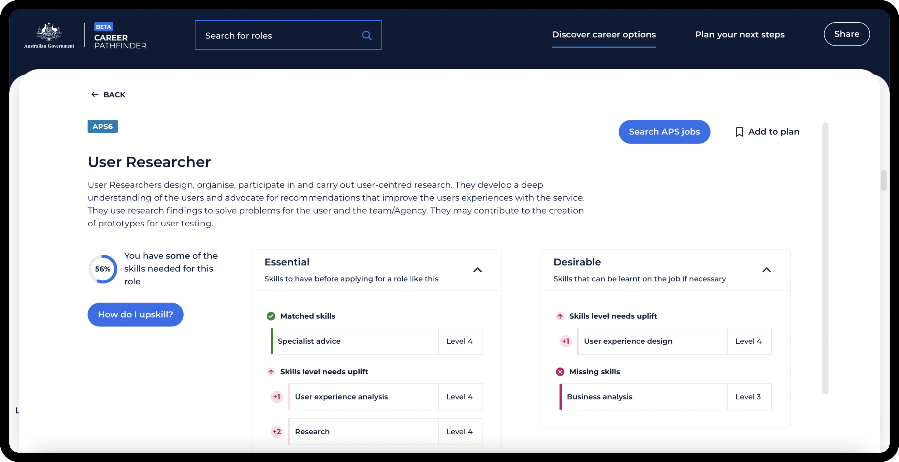
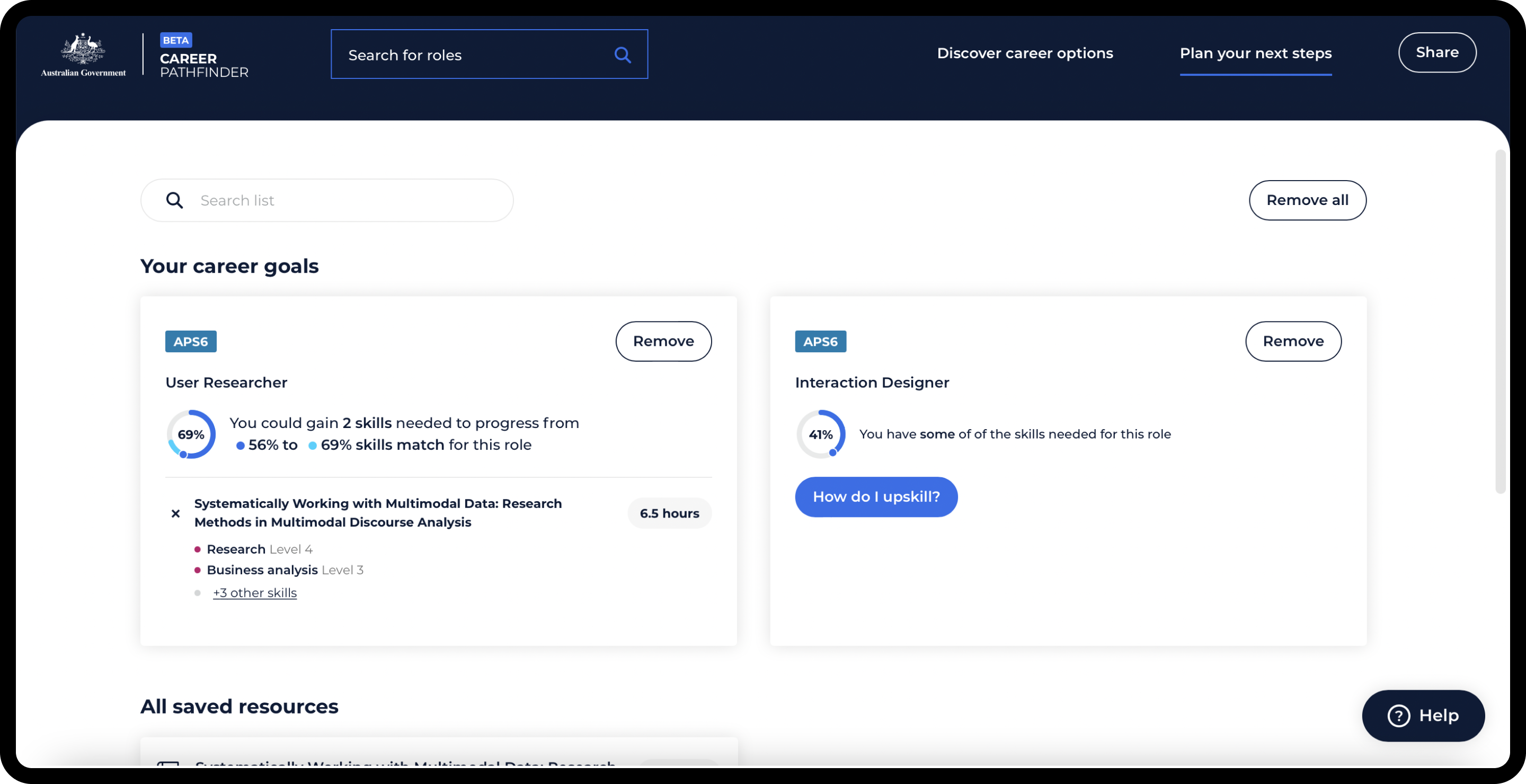
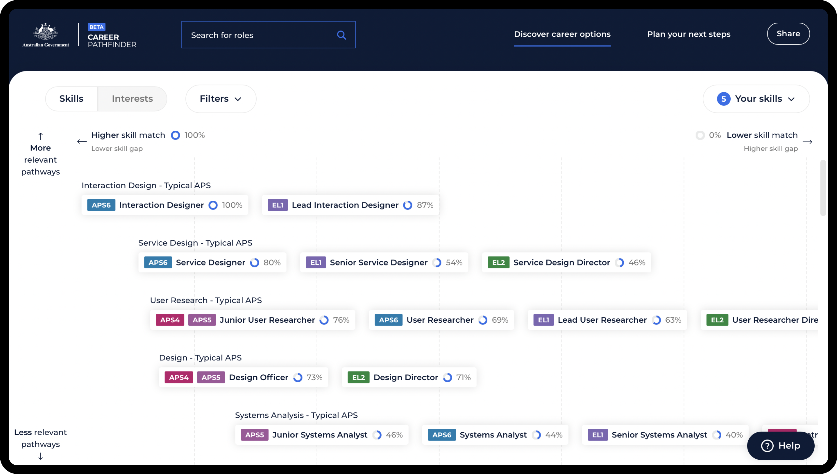
Career Pathfinder is an interactive tool that allows people to explore digital careers available within the Australian Public Service, by adding their skills to visualise potential pathways and tailored learning options. The APS needed a strategy to attract and keep digital talent within the government, most of whom were unaware of the career advancement opportunities available. I designed the Beta version of the tool, which visualises the extent of roles within the government and provides a roadmap on how to get there.

My role
I was the Lead Designer on this project, driving the user experience, user research and visual design. I led 8 design sprints throughout the project, collaborating with a team of designers, developers, managers and product owners. My responsibilities included:
Leading and guiding the discussion in design sprints
Concept generation through sketching and collaboration
Experimenting with existing data to validate concepts
High fidelity prototyping
Participating in user testing sessions - alternating between conducting the interviews and note-taking
Synthesising results into outcomes, key findings and recommendations
Developing solutions to complex problems - those dealing with data, requirements or feedback from usability testing
Updating the visual design
Problem
Employees in the Australian Public Service often didn't know the extent of opportunities available to them to develop their career. They want to do something that interests them, has increased demand or offers better pay. If they don't easily find these within their organisation, they tend to leave and join the private sector.
Process
It was important for the client to follow a user-driven design process, where concepts are continuously evaluated by users. As a result, we used the design sprint methodology in combination with an agile development process.
The project started with a review of the existing tool to check for any usability issues, as well as identify opportunities for improvement.
Since the Alpha version was a work in progress, there were obvious gaps in usability and features, specifically:
The visualisation of roles failed to address user needs and expectations
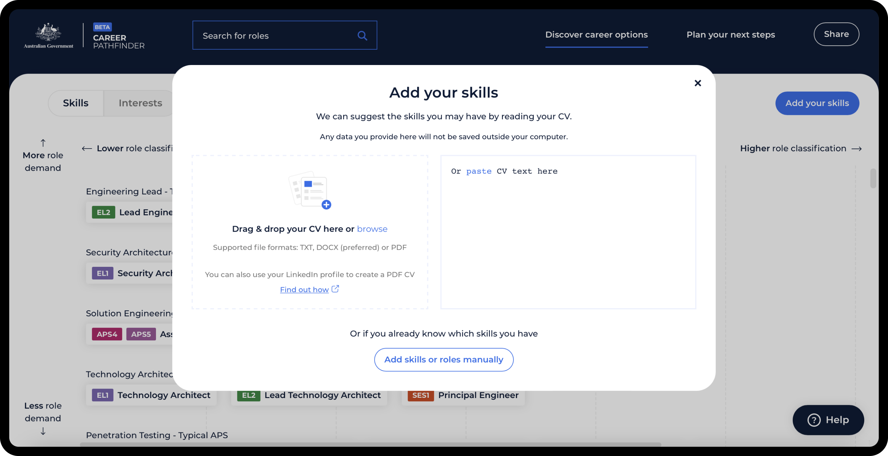
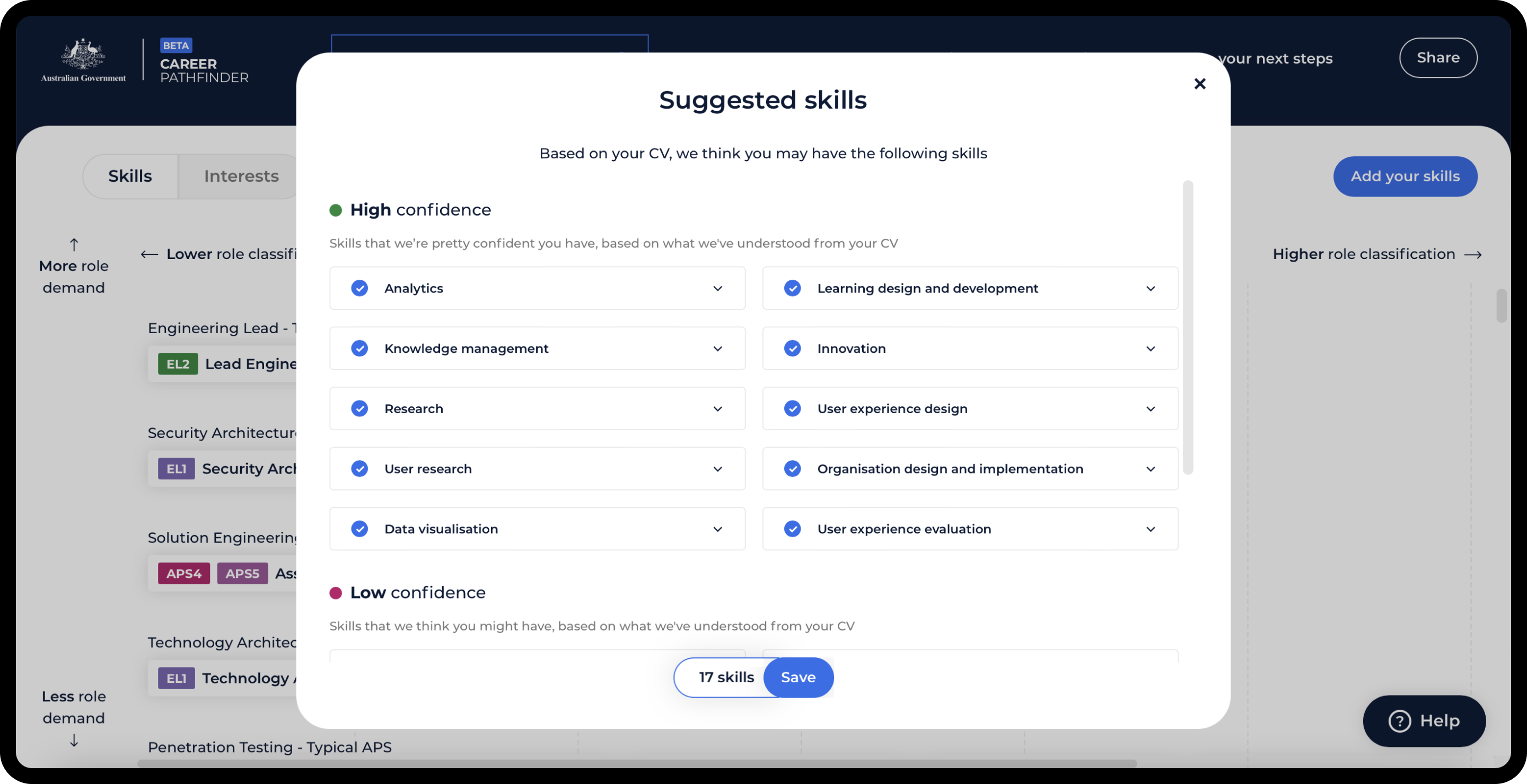
The process of adding skills was tedious and time consuming
Discovery of roles was very limited, and relied entirely on skills added
There was limited capacity for a user to save their data to build their professional profile
While the tool was able to diagnose a gap in the user’s skill set, it didn’t help solve the problem of how to upskill to a particular role
The interface itself was visually overwhelming, negatively impacting user experience
In the previous phase, generative user research was conducted and documented, which I used as a starting point for planning future sprints. The client was highly invested in this project and motivated to improve the tool with a list of desirable and prioritised requirements. These were derived from a combination of previous user research and business oriented objectives.
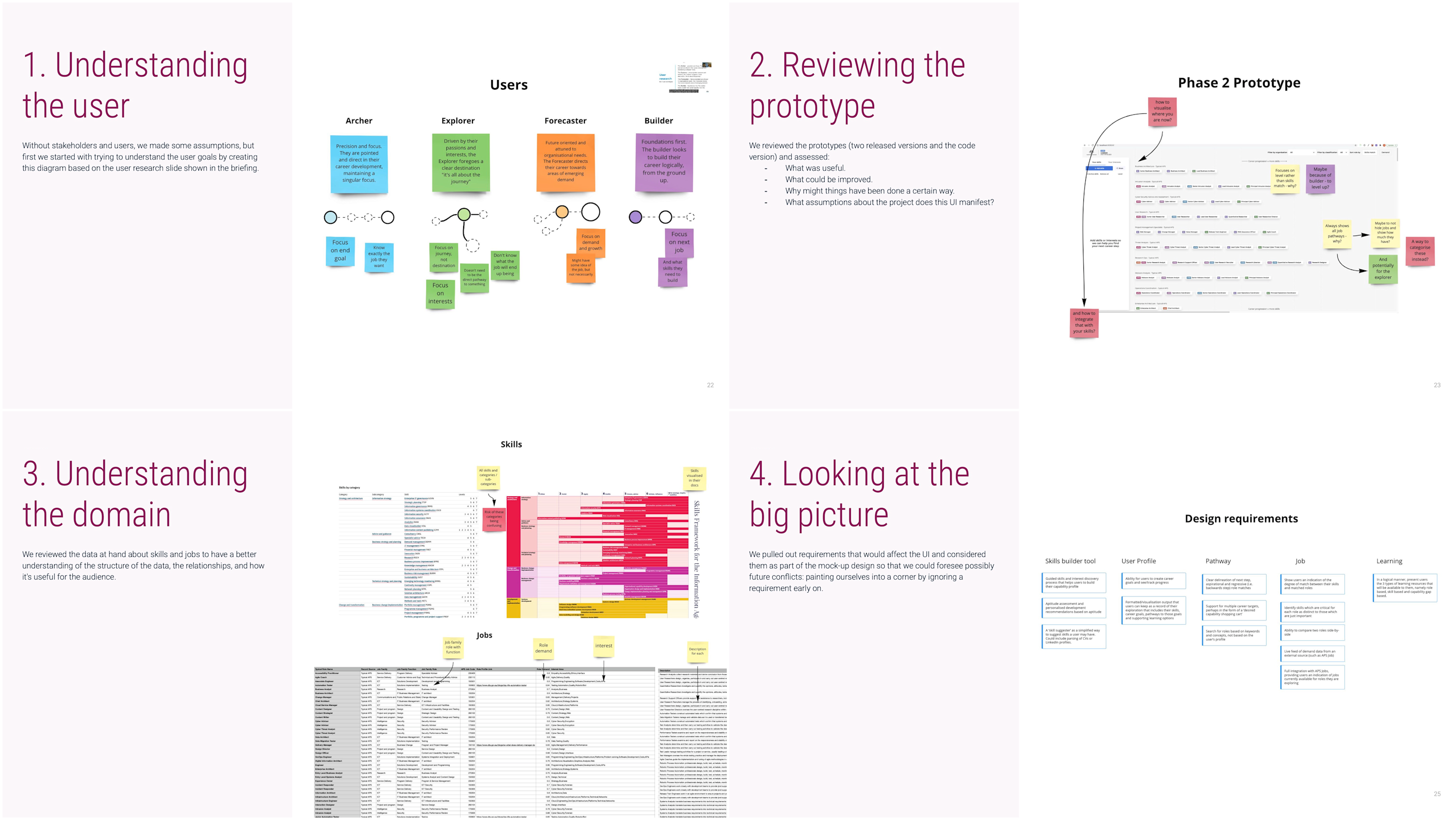
During the kick-off workshop, we explored all prioritised requirements in detail, focusing on the background and purpose, discussing any obvious design / tech related constraints and potential blockers. This allowed us to schedule and plan out each sprint.
Since these design sprints were remote, we made full use of Miro, Figma and Teams to collaborate. Each sprint kicked off with goals and potential risks - helping us identify the purpose of each requirement, as well as highlight any constraints.
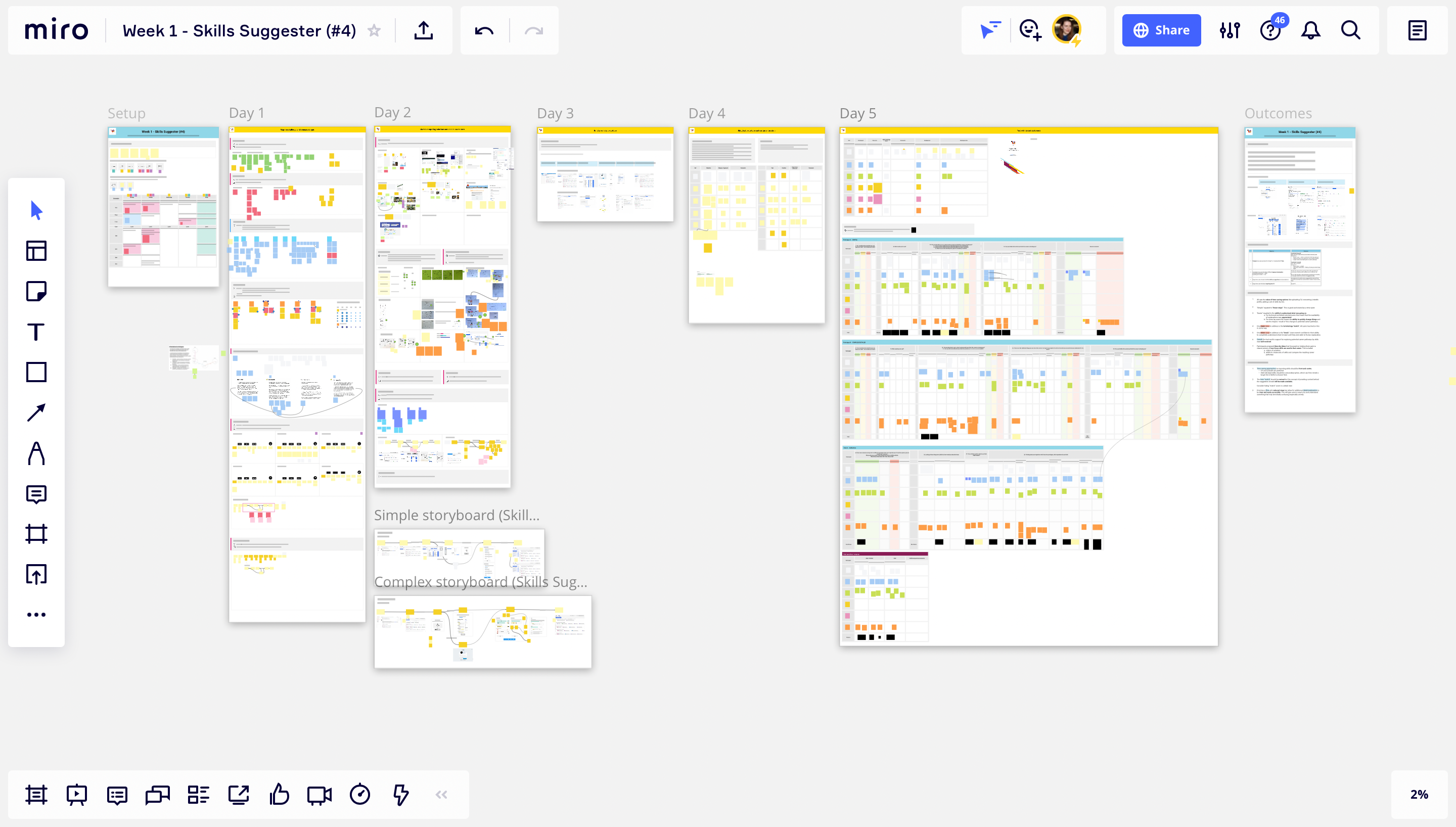
The next session was centered asking the “experts” - those who knew the most - questions. This was immensely helpful, as even though the product owners had an excellent overview of the entire project, these experts had detailed knowledge of a particular topic related to the requirement, such as human resources or learning management systems.
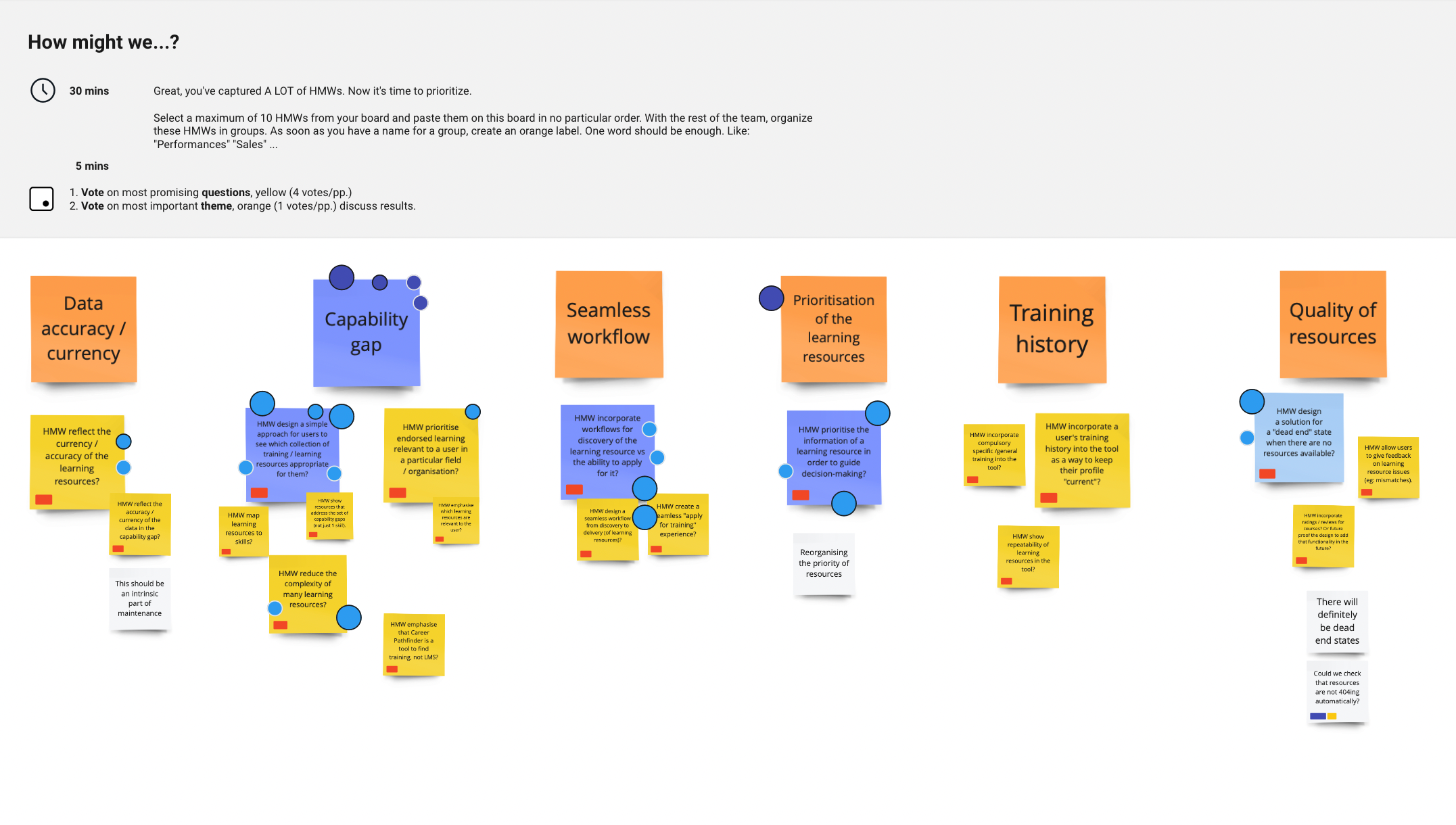
Throughout these sessions we captured a lot of notes and HMW’s (How Might We… statements used to frame design problems). Then it was time to organise these into groups / themes, and where everyone voted on focus points for the sprint.
While we concentrated on the week ahead, we also reflected on the users and the current user flow. We discussed the user’s needs, goals and pain points in relation to this requirement, which helped us map both the current and ideal user flows.
For the lighting demos, we asked everyone to showcase a product or service they found inspiring for this sprint. These helped the team to branch out from typical solutions and recognise aspects they liked / disliked.
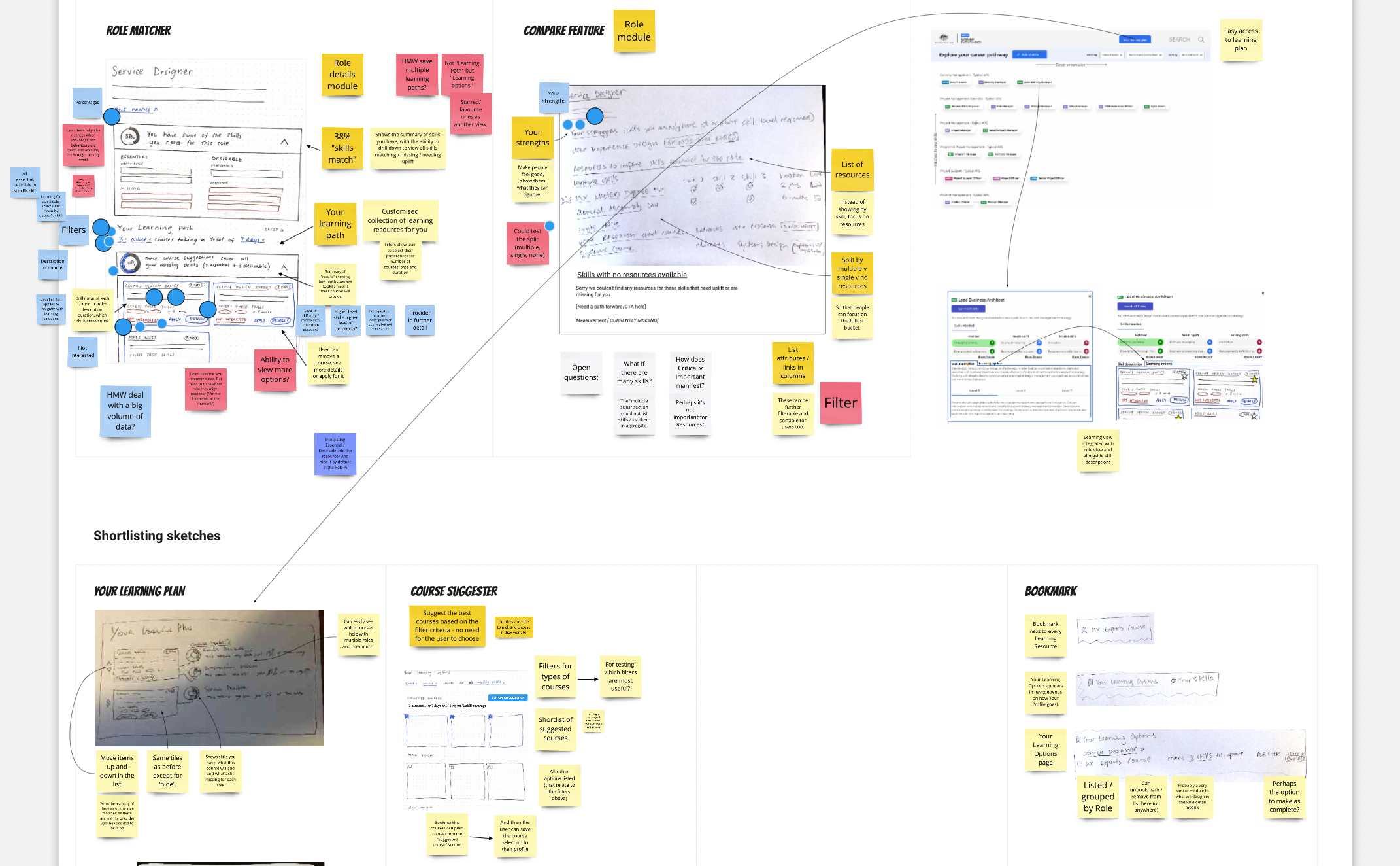
The sketching sessions were very helpful in clarifying ideas and concepts, especially from the product owners. As these sketches couldn’t exactly be anonymous in such a small team, it felt more natural for each person to present their own sketch. This worked quite well, and in conjunction with the dot voting, usually cemented a way forward.
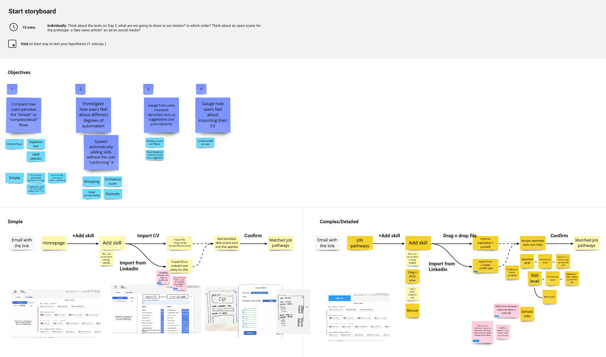
Next, we constructed objectives that would be used as the underlying hypothesis of the sprint - things that we wanted to answer during testing. These objectives were used to develop the storyboard, to ensure that all aspects of the prototype flow would be tested. The script was usually developed alongside so that both would align when it came to testing day.
I created the prototypes in Figma using their existing visual style, focusing on elements that would address the objectives. Sometimes this included designing a completely new interface, providing two alternatives for the same concept or experimenting with the role / skill data.
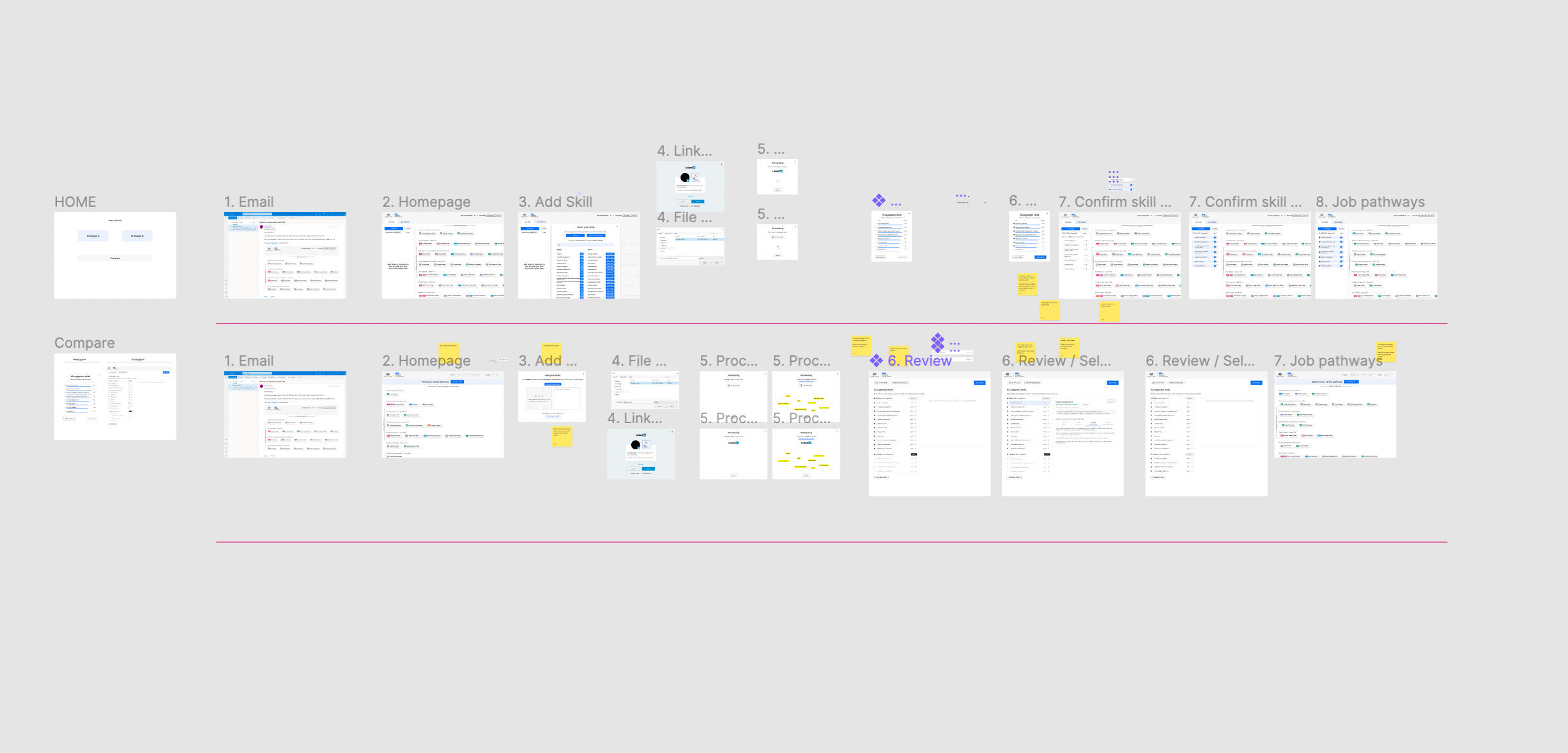
The day before testing we conducted a pilot test, as a catch-all for any issues with the prototype, script or overall flow.
We would aim to conduct the usability tests with 5 participants, but sometimes this fluctuated between 3 and 6. At the start of the project, we had a list of interested candidates from the client, which was our main method in sourcing and screening participants.
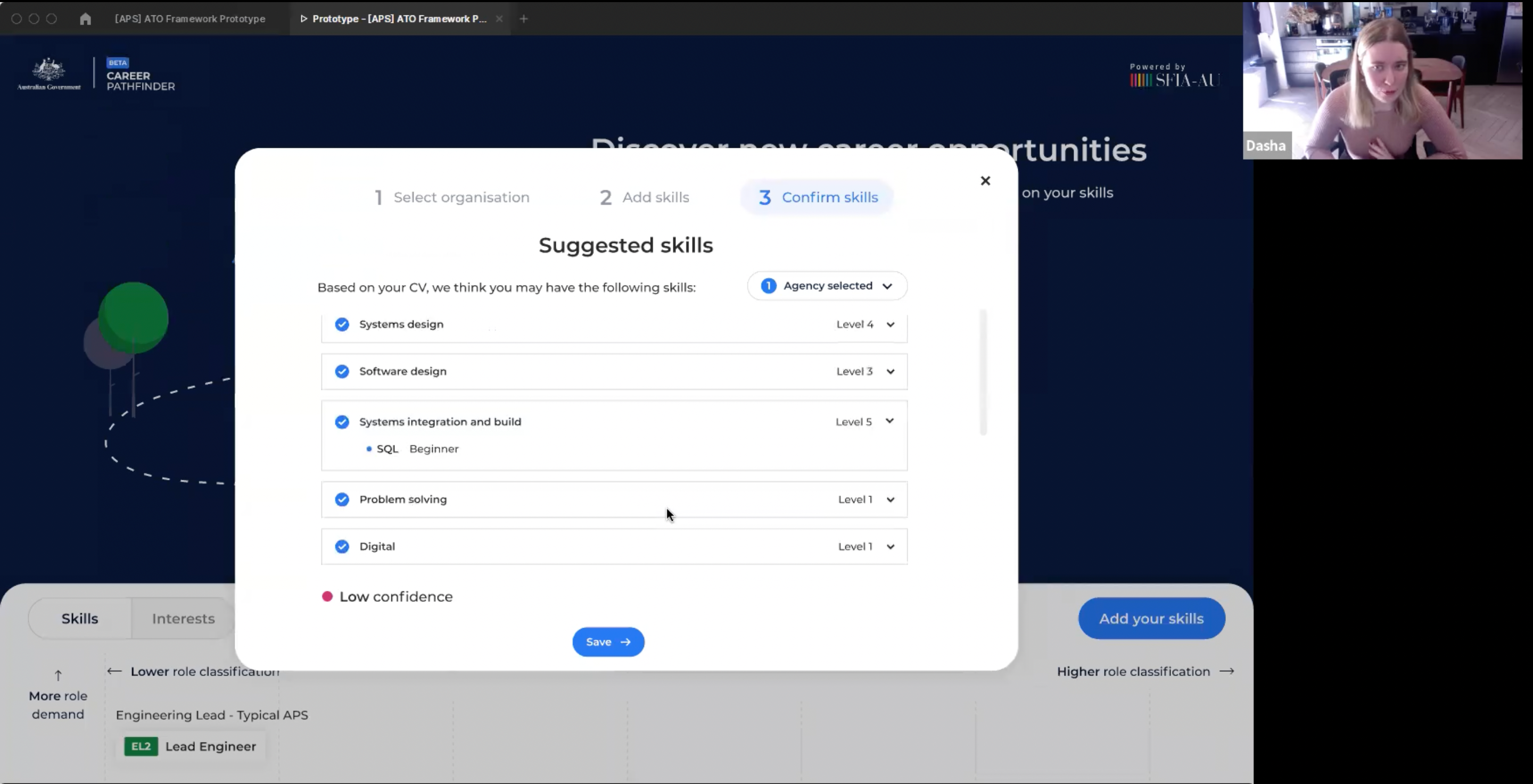
Each testing session would range from 30 to 45 minutes (depending on the sprint). The interviewer would guide the participant through the prototype using a series of tasks, pausing to ask any questions to clarify the participants’ actions or musings.
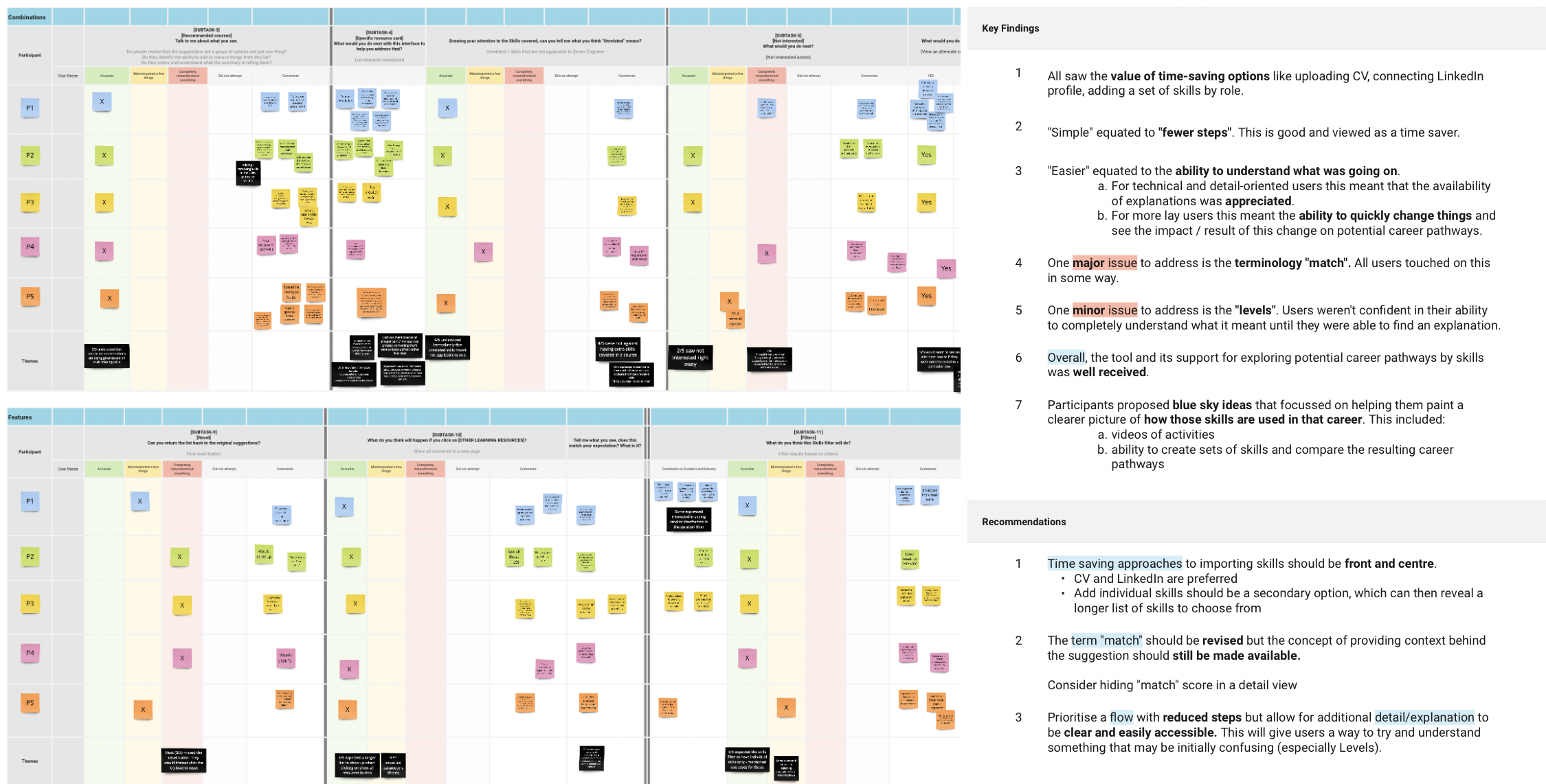
Synthesis of the results was made easier as we used an organised method of note-taking in Miro, which made it easy to visually compare notes across participants and tasks. I structured these results by objectives defined earlier in the week, highlighting key findings and suggesting recommendations.
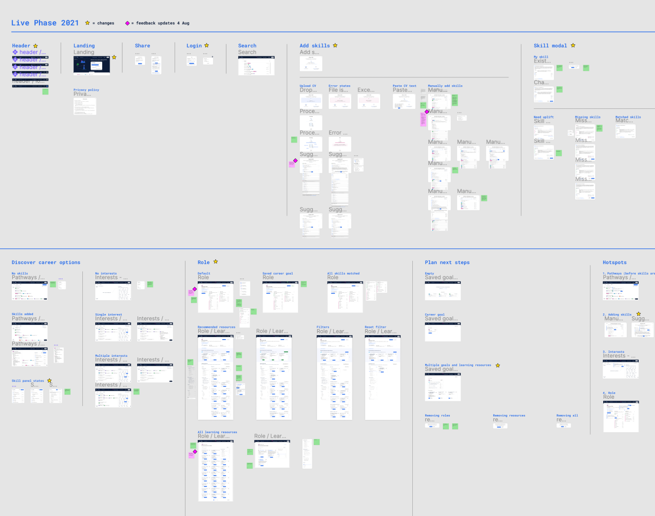
After every 3 or so weeks we would take a break from design sprints and focus on implementing recommended changes. This was also vital for the development process, as I needed to hand over final visual designs before starting a new set of sprints.
Solution
Professional platform for government employees - and those aspiring - to explore their potential within the Australian Public Service. Intuitive and modern, the tool introduces the concept of roles and pathways, and guides the user on their own journey of career planning.
In the current Beta version, users have the ability to automatically add their skills using a CV, view matched roles and discover new ones, as well as visualise the skill gap in order to create a personalised learning plan. There is also functionality designed for user profiles, which is currently in development.
