Back to all projects
Not A Single Origin - Chocolates
Visual Design, Data Visualisation
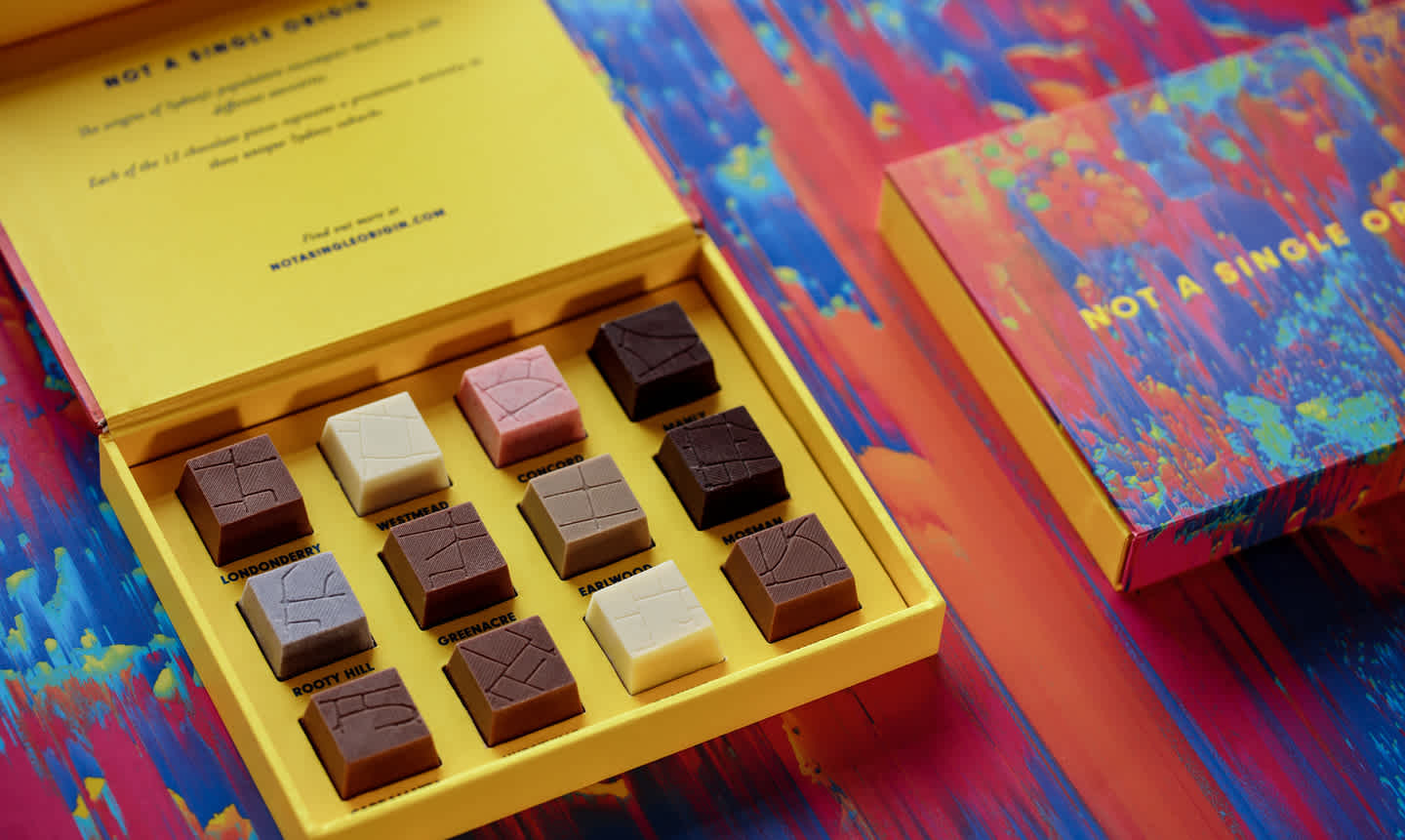
Not A Single Origin is a data-driven chocolate project, a collaboration between design agency Small Multiples and chocolatier Meltdown Artisan. The chocolates tell the story of Sydneysiders, where they come from and where they settled. I led the concept, design and fabrication of Not A Single Origin – award winning chocolate boxes which sold out in hours and made headlines across Australia.


My role
I worked in a small team of four - leading the design and execution of the concept. Specifically, I:
Defined the concept and executed subsequent research
Prototyped with ABS data to refine the data visualisation component
Worked with geospatial data and 3D modelling software to create the shape of the chocolates
Using the 3D chocolate models, 3D printed moulds to be used for chocolate making
Conducted blind flavour tests
Developed the visual style
Designed the packaging, using a combination of food photography and post-processing
Challenge
Primarily used as a promotional product, the challenge of this project was to create data visualisation that transcends the screen and uses food to represent data.
Using chocolate as the foundation, data visualisation had to be a sensory experience, incorporating both taste and touch. The concept behind the data visualisation had to be relatable - and what is more relatable than the origins of us?
Process
The concept focused on the diversity of Sydney and its suburbs - how they can influence language and culture.
I used the 2016 ABS Census as the starting point, exploring how various datasets can represent diversity. While not extensive by any means, ancestry was the most representative.
The next step was to determine exactly which ancestries would be represented as chocolates. Using only Sydney ancestry data, I mapped each ancestry to a global region. Using the ratio of regions, I assigned a quantity of chocolates to each region.
Sydney's ancestry distributed across the globe
To determine the specific ancestries, I used the top ancestries of each region (excluding Australia).
I then mapped the ancestries to suburbs, specifically those who had the highest percentage of the selected ancestries.
Selected suburbs with representative ancestries
The flavours were determined next, as these had to represent each suburb and ancestry. I collaborated with Jen, founder of Meltdown Artisan, on flavour profiles.
I conducted two blind tests to see if the flavour of the chocolates could be connected to the ancestry. Based on these results, Jen adjusted the flavours.
The exterior of the chocolates was also important, as I wanted tactile touch be part of the sensory data vis experience.
I decided on using the landform of each suburb – the streets, parks and natural landscapes.
Creating this form on chocolates was the most challenging and time consuming part. We first tried using a transfer sheet to "print" the design on the chocolates. However this had several issues, the most obvious being low visibility on darker chocolates.
The next method was more promising - creating unique moulds for each suburb. However, doing so commercially would prove to be extremely expensive.
Instead I experimented with 3D models of the streets, printing these using a food-safe filament. Unfortunately, I went through many trial and errors – as the chocolates kept breaking.
Eventually I was able to get the right thickness, height and slant of the indents – succeeding in perfect chocolate imprints.
With the chocolates finalised, packaging was the final step.
There needed to be an element of surprise, a reveal of sorts. For each person to eat the chocolate and taste the association to the suburb.
Interior packaging concept of the chocolate box
Likewise, I wanted the exterior of the box to reflect the interior. I sliced, diced, and smeared ingredients to produce striking textures. Using a lightbox and a camera, I was able to capture fine details of the fruits, nuts, jams and spices.
In post-processing, I composed all images together to create a harmonious, eccentric and hyperreal artwork.
While aesthetic, I wanted to take it one step further. I collaborated with a creative developer to create a program that would manipulate the image to create a surreal terrain. Through many iterations, we decided on the final design below.
Solution
A limited edition chocolate box - only 50 were ever made - featuring the taste of Sydney suburbs.
The chocolates sold out in just under 24 hours, as Not A Single Origin was featured in Concrete Playground, The Urban List, Broadsheet, taste and many more.