Back to all projects
COVID-19 Data Futures Platform
Data Visualisation, UX Design, Visual Design
UNDP’s COVID-19 Data Futures Platform is an interactive data platform for policymakers who are looking for meaningful insights into COVID related data - all from a single trusted source. At the beginning of the pandemic, there was a distinct lack of resources for these policymakers, who were frustrated at the lack of helpful and reputable data they needed to make policy decisions. I designed a solution that would take into account location-based socio-economic, health and COVID related data to provide a comprehensive and dynamic platform for observation, insights and analysis.

My role
I was the Datavis Designer on this project, working in a team consisting of designers, product managers and developers. My contribution was to:
Use UNDP outcomes to propose data visualisation solutions that communicate relevant insights
Recommend data sources from UN’s catalogue to match those outcomes
Develop visualisation solutions for data challenges, such as missing data or inconsistent date ranges
Prototype with real data to produce proof of concepts
Advance the visual style of the platform alongside evolving requirements
Participate in a collaborative design and development process with the entire team
Problem
During the beginning of the COVID-19 pandemic, policy makers, government officials and UN staff struggled to find substantial and reputable insights to help them make decisions surrounding the global situation. Existing dashboards lacked context, and often had too much and too low quality data.
In the cases where data was accessible, it was always from many different sources, each with unique variations in the ways it was collected, processed and analysed. Comparing and contrasting these datasets would have been time-consuming and tedious, and highly unrealistic as they lacked resources in analysing the data themselves.
Process
My involvement in the project started after the initial discovery and scoping phase. The key users, value proposition and success metrics were already established, as well as an initial proof of concept. Throughout the project, we collaborated closely with the UNDP team - who were located all over the world - to develop a solid foundation for the project.
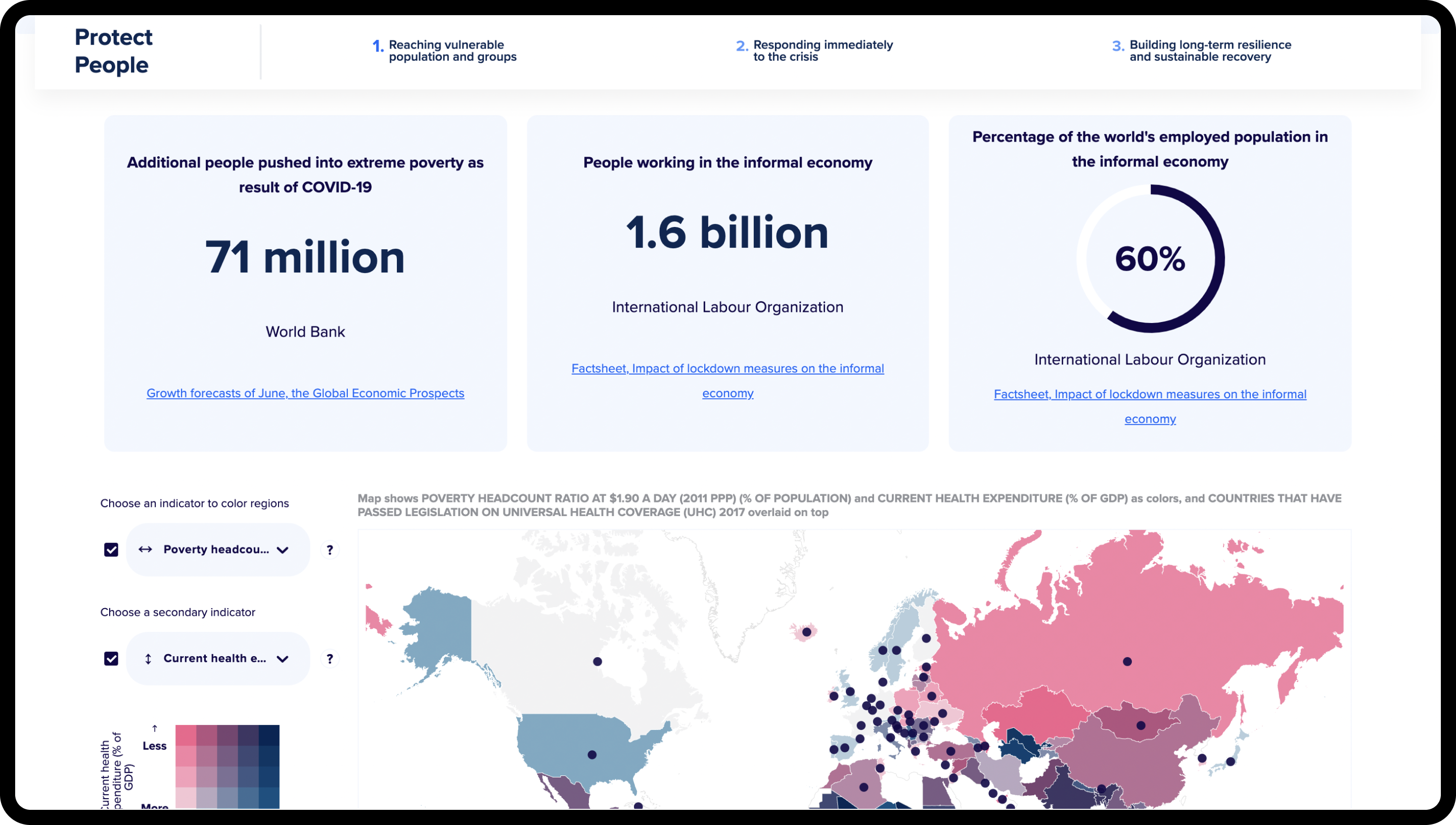
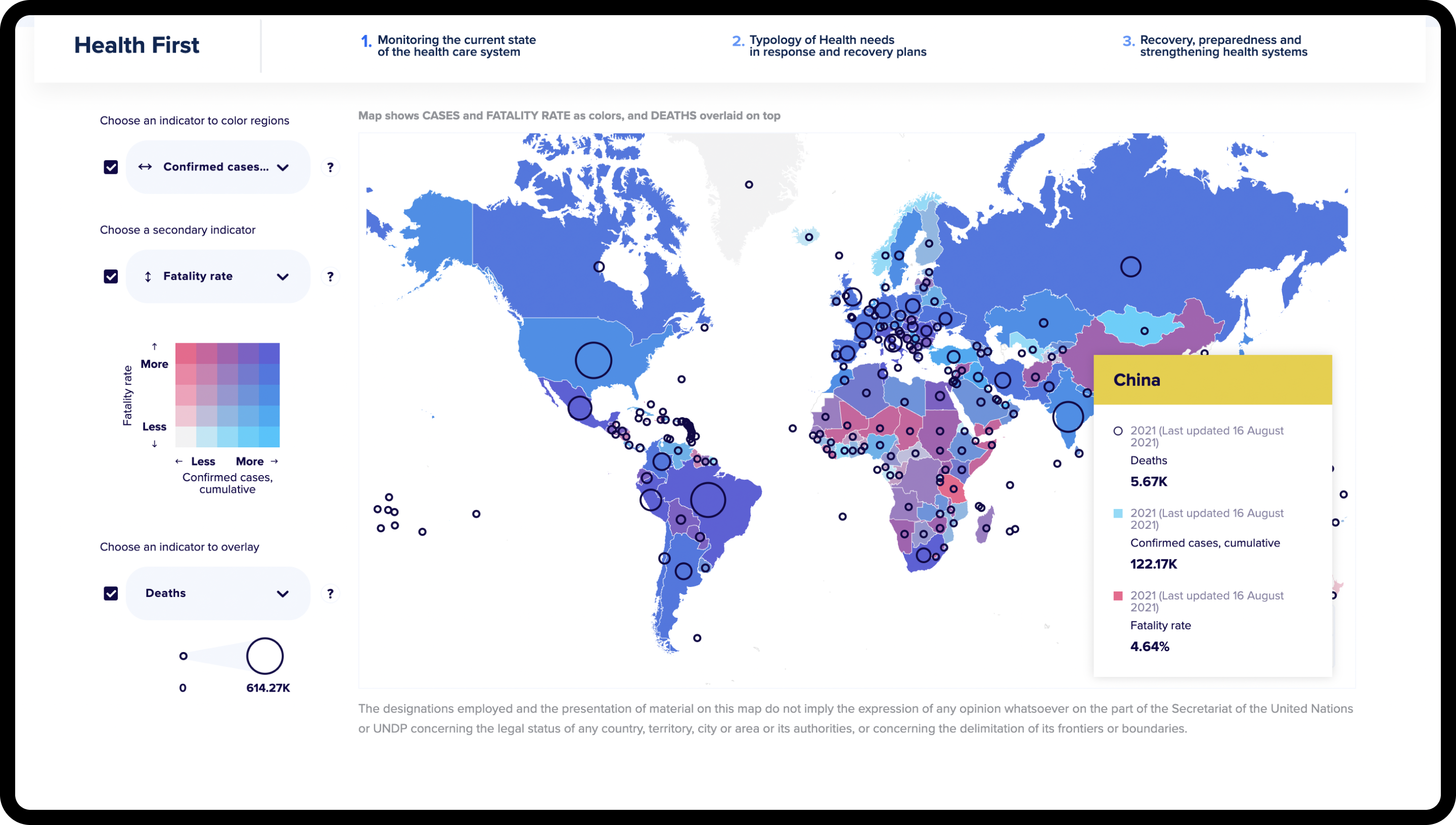
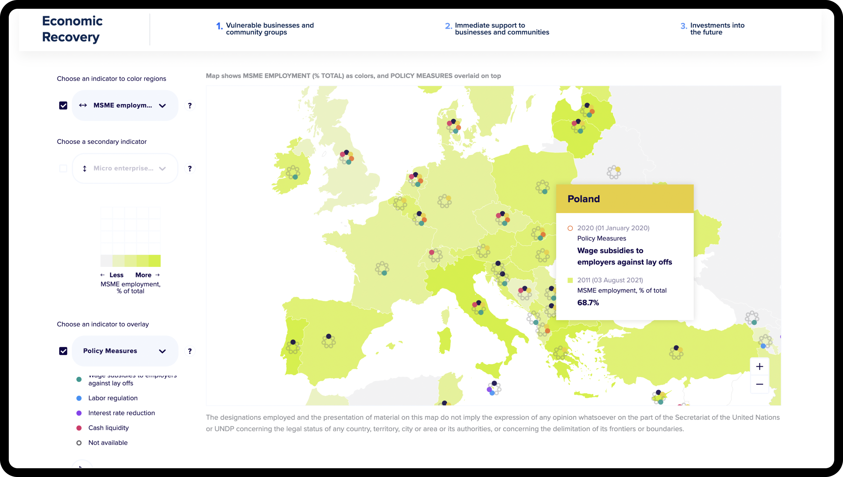
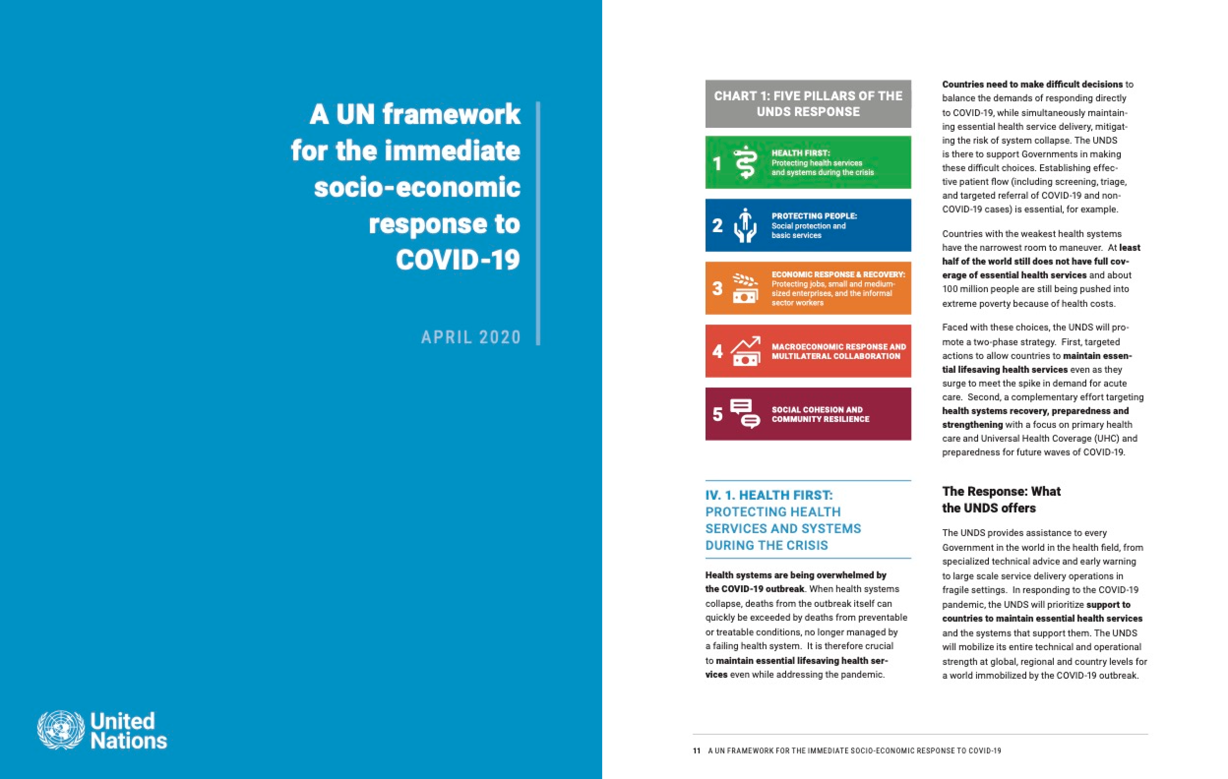
UNDP required this data platform to be consistent with their other existing publications - specifically A UN framework for the immediate socio-economic response to COVID-19 (April 2020). These included five themes that underline the response:
Health first: Protecting health services and systems during the crisis
Protecting people: Social protection and basic services
Economic response and recovery: Protecting jobs, small and medium- sized enterprises, and the informal sector workers
Macroeconomic response and multilateral collaboration
Social cohesion and community resilience
As a result, the design of the visualisations - and subsequent data platform - were structured around this framework.
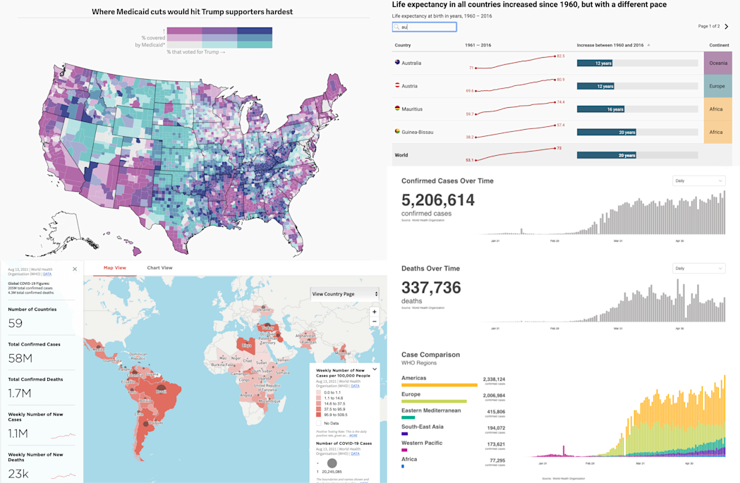
I started with a brief comparative analysis of existing data portals, visualisations and interactive tools. I looked for innovative solutions to problems such as density of data, inconsistent date ranges, complex data stories and dashboard fatigue.
Using the existing concept as a starting point, I began experimenting with data from UNDP and WHO. Since geographical location was one of the main aspects of the outbreak, I focused on the hero of the tool - the world map.
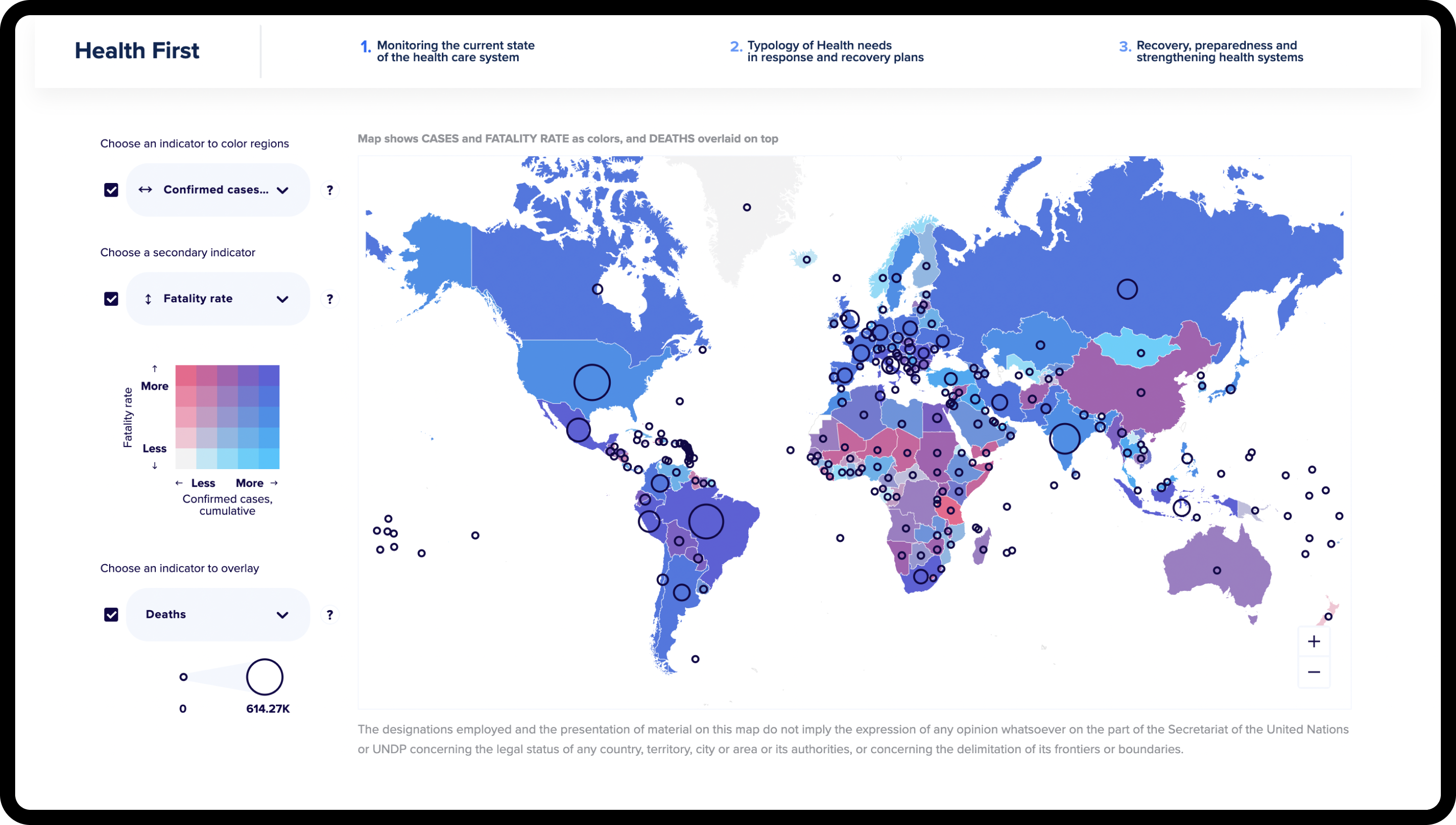
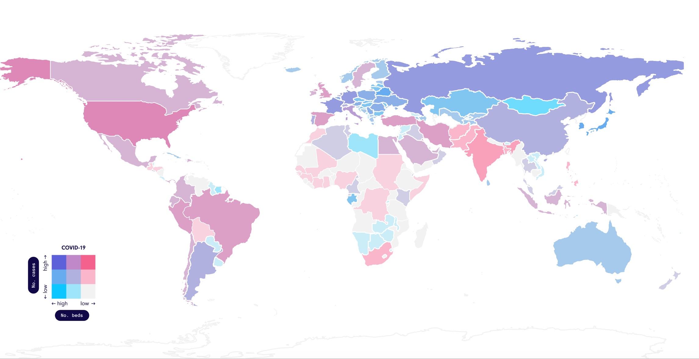
I used a bivariate map approach to highlight significant insights that only become prominent when two data points are observed together, such as the number of cases and beds available. While a high number of cases might be an indicator that the country is struggling with COVID-19, not being equipped to deal with such an outbreak could be far worse. Below is one of my earlier concepts (data from May 2020), where pink is used to highlight the worst scenario - high cases and a low number of beds.
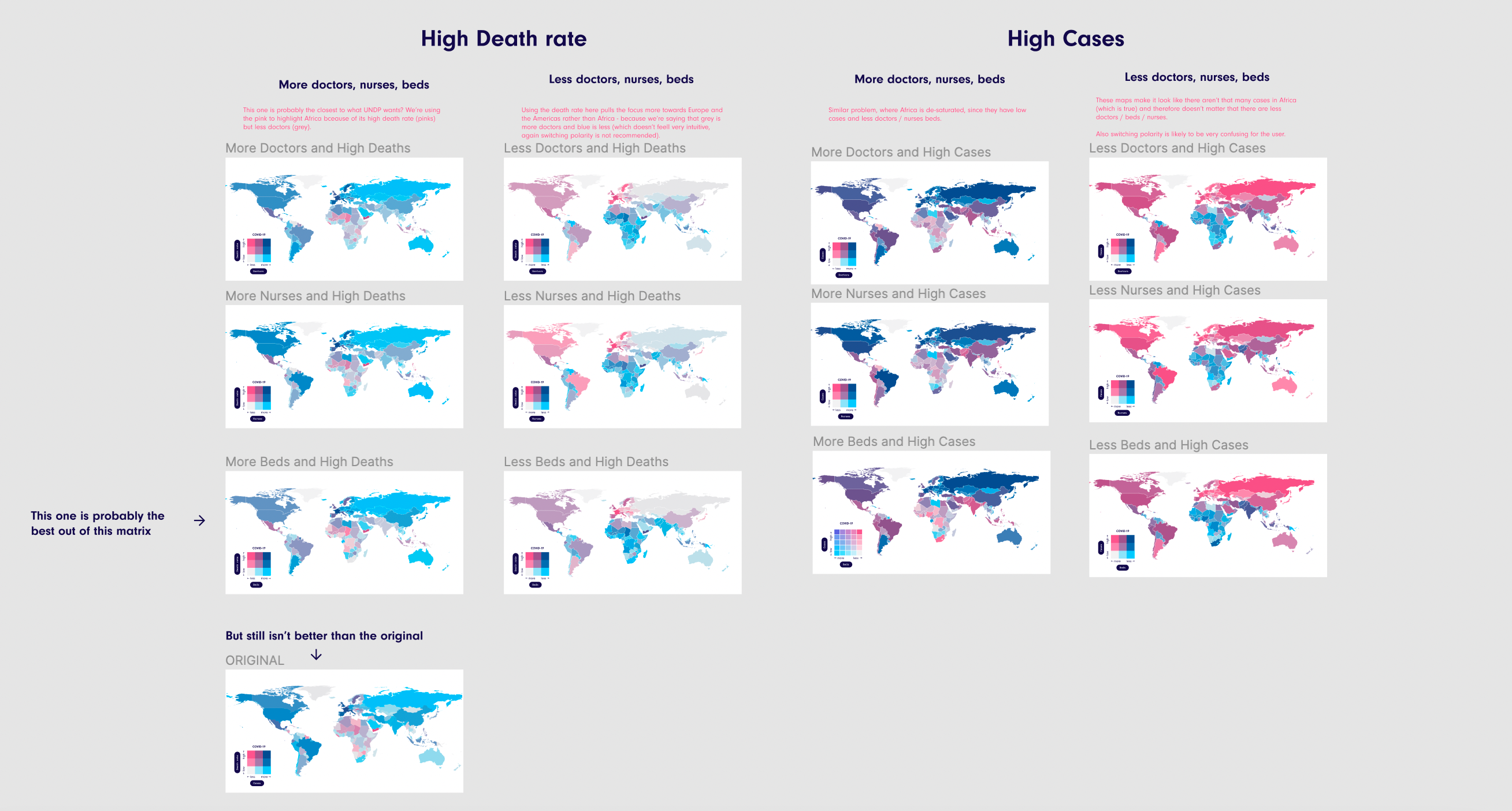
One of the important aspects of this data platform was versatility - where evolving data and stories should be easily represented using existing visualisations. This bivariate map concept worked quite well as it allowed any data indicators to be represented easily worldwide.
Later on, I added a bubble chart on top of this map which allowed for a third dimension to be visualised, as well as making some adjustments to the colour scale to be more intuitive.
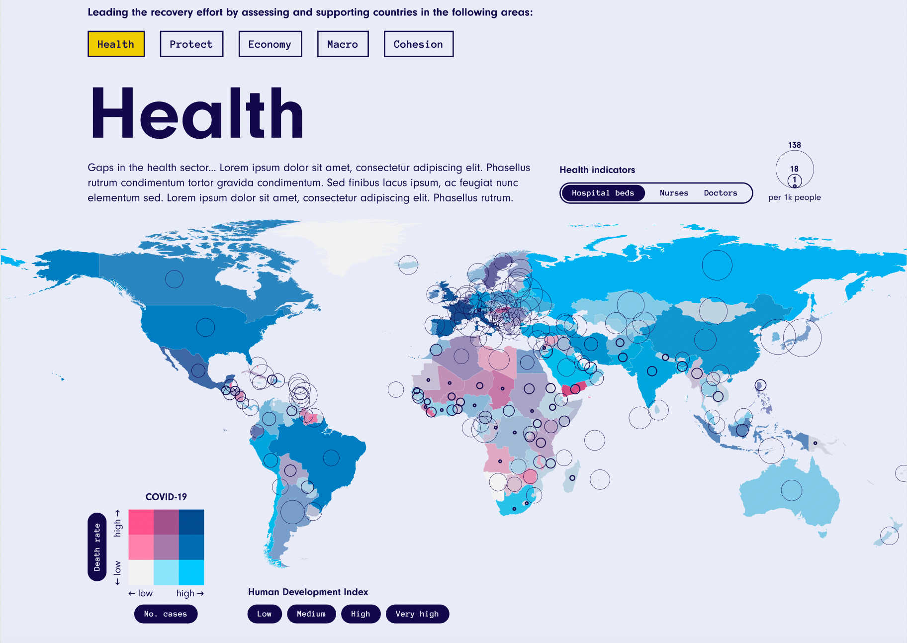
While this single map was useful for health data, we found that socio-economic data needed more surrounding context to emphasise the insights.
As a solution, I chose to include factoids that would summarise the data visible on the map. These would address the current social situation and help answer the overarching questions of each theme. Originally, I designed these to be dynamic and update with the selected indicators, however a more tailored approach was later preferred to produce clearer insights.
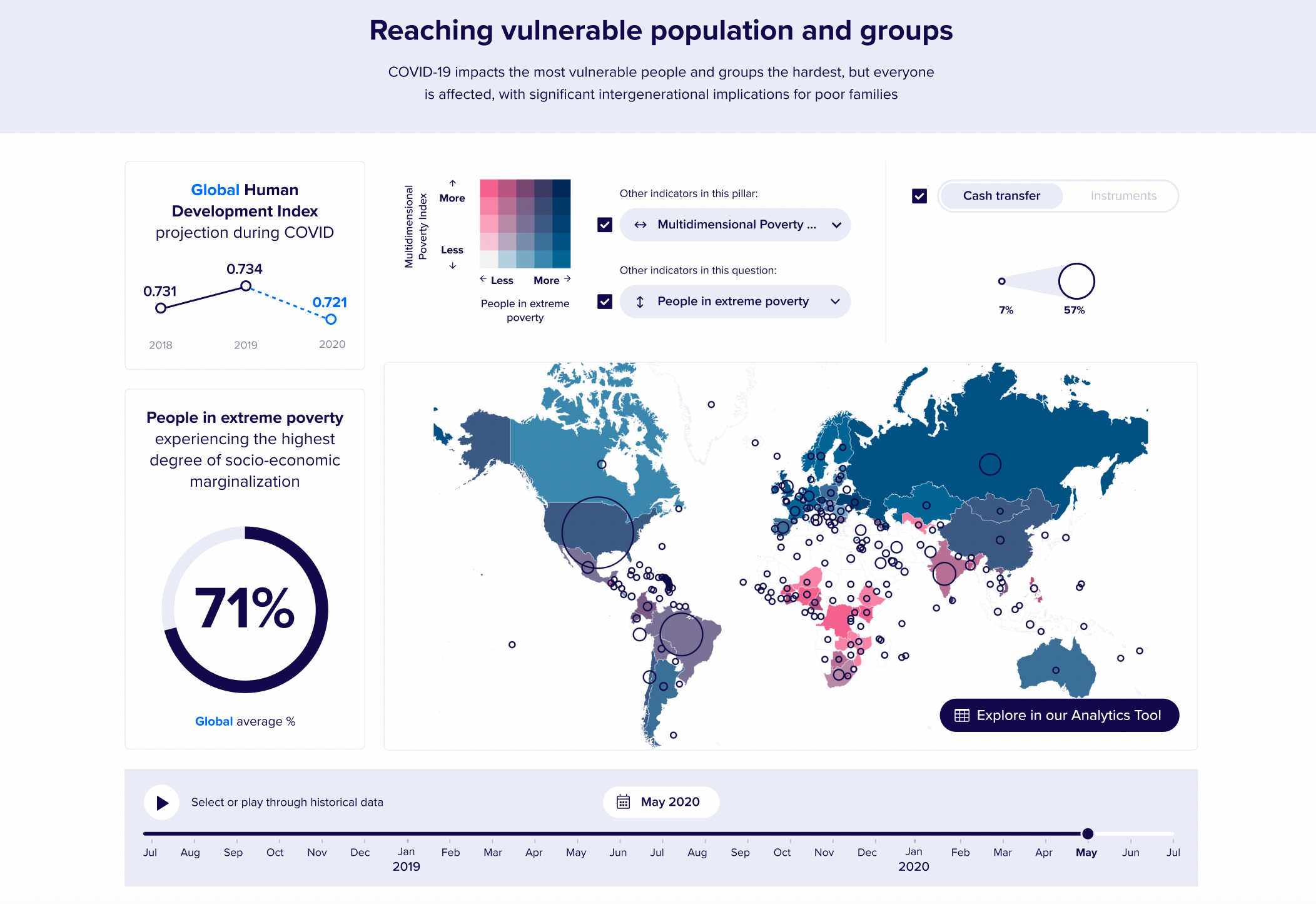
After a final round of visual designs, I handed the project over to the developers - who integrated the data and built custom visualisations.
As we were only responsible for the data visualisation embeds - and not the entire website - some design elements were changed later on when this project was handed over to a separate agency that eventually built the website.
Solution
A global data platform utilising many different sources of data to help answer one vital question - how do we take into account the underlying risk factors of the past and the current impacts of COVID-19 to help inform a response to the pandemic?
The COVID-19 Data Futures Platform has supported UNDP's socio-economic response plan, surfacing meaningful data and insights to help provide context into the evolving situation.
