Back to all projects
Clipsal Pulse Mobile App
UX Design, User Research
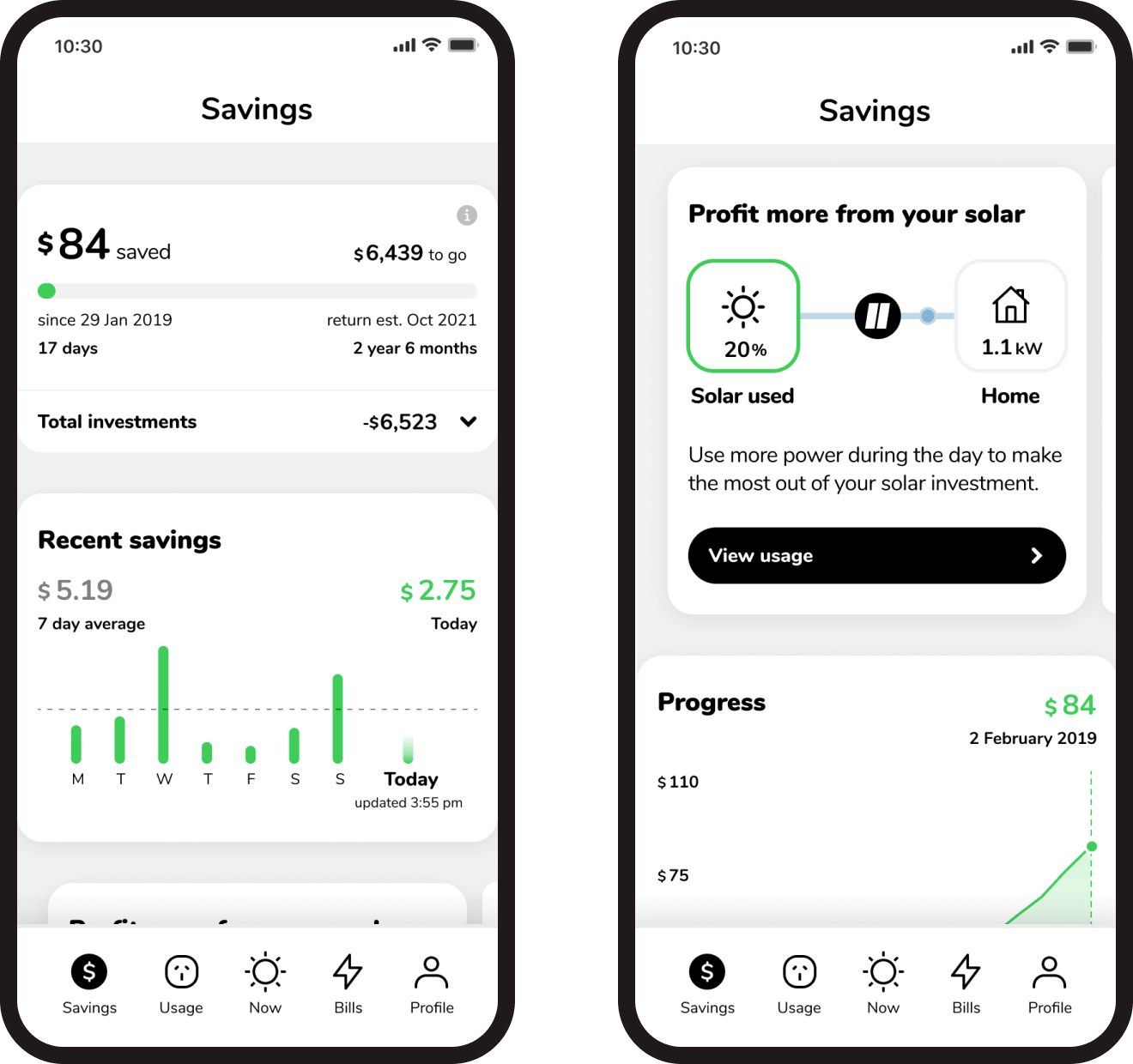
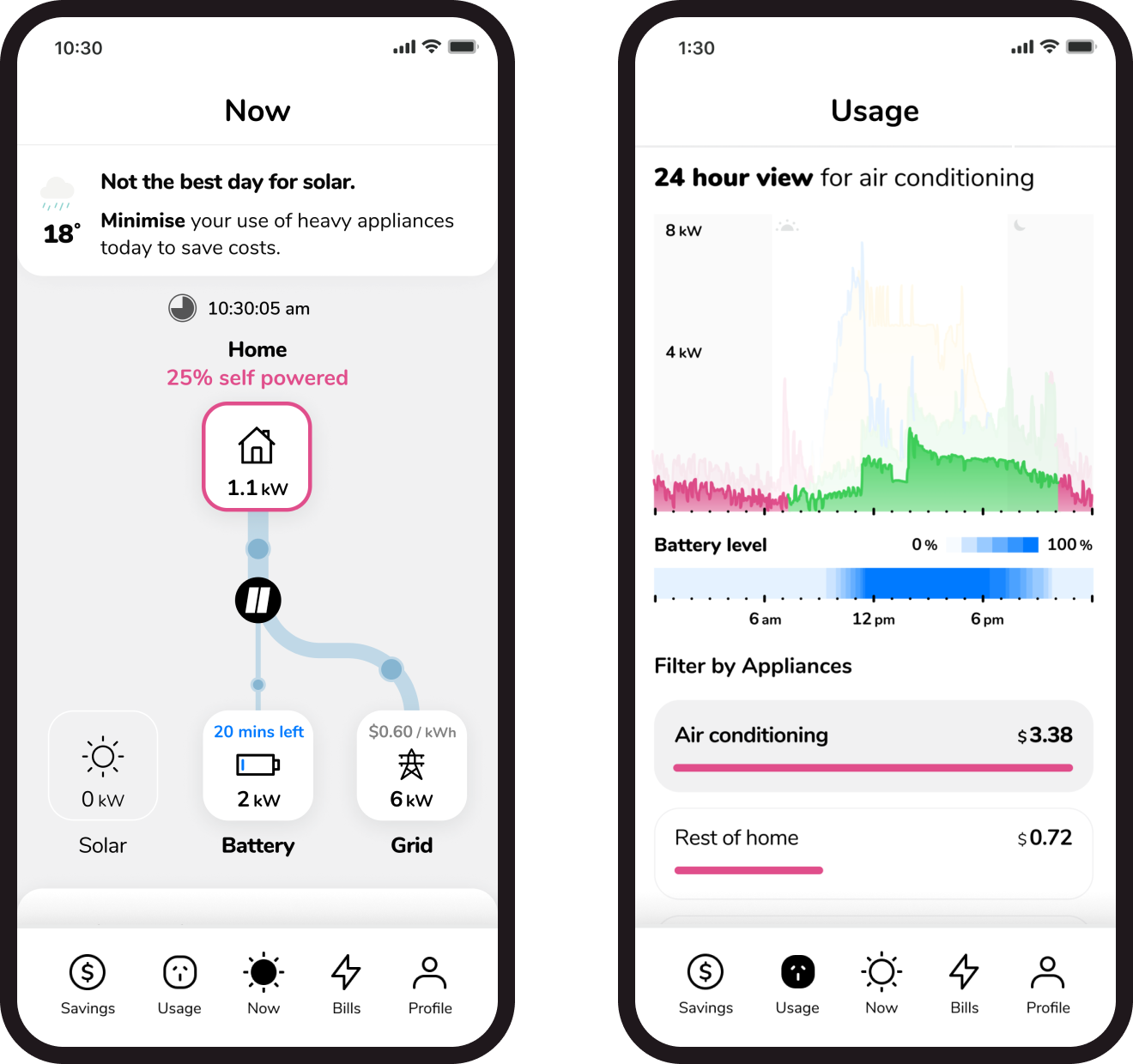
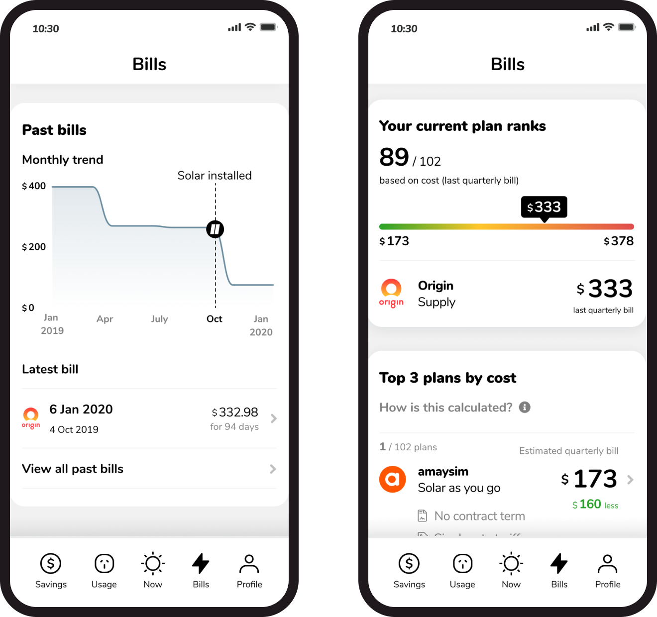
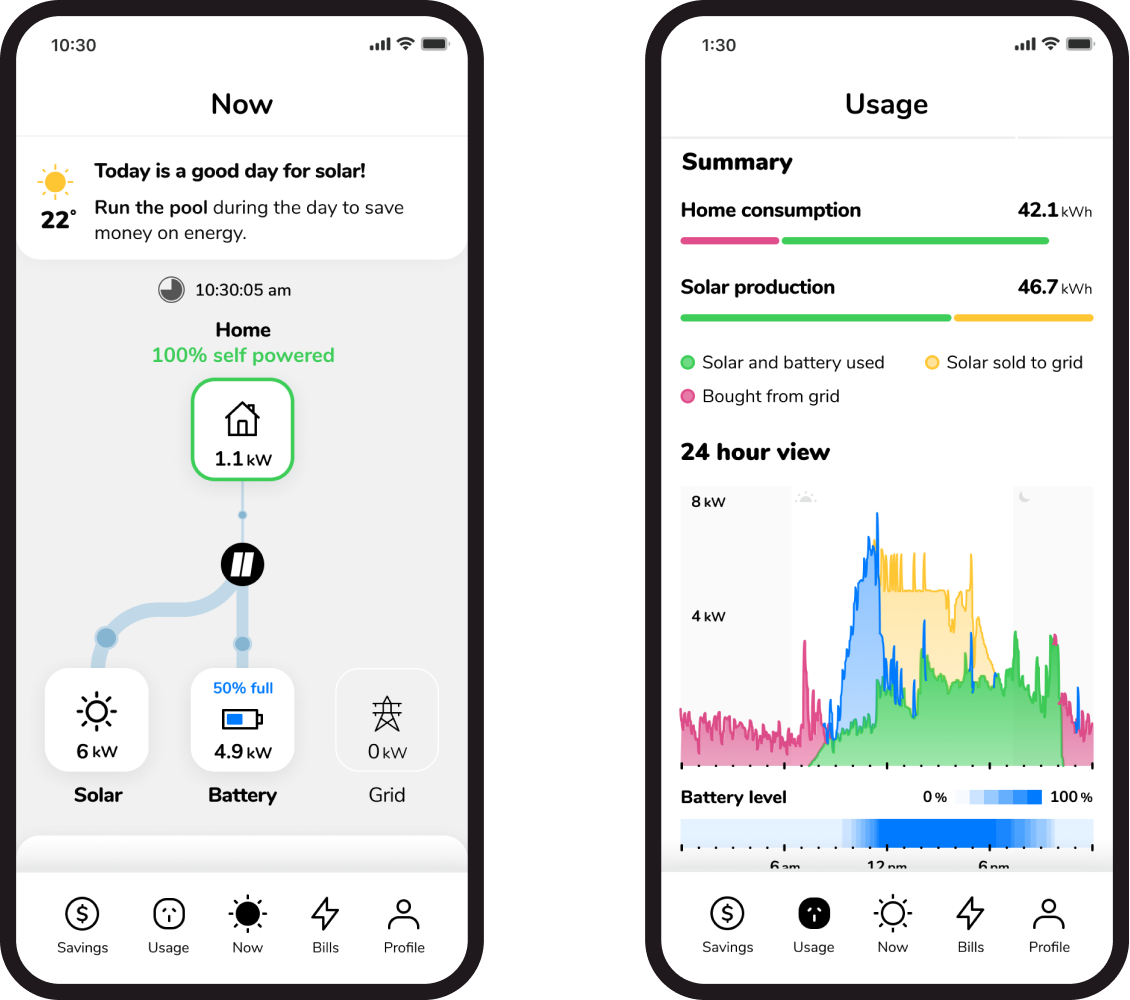
Clipsal Pulse is a mobile app for solar energy systems, to make energy consumption simple and transparent for consumers. I embedded with the Clipsal Solar team to help them define a roadmap towards their MVP launch, bringing design direction and user focus into their process.
My role
I was the UX / UI Designer on this project working alongside the user researcher and the rest of the Clipsal Solar product team. I was responsible for:
Bringing clarity to their vision and process through the product mission, customer emotional journey and key user flows
Fostering ideation within the team through comparative analysis and sketching sessions
Utilising data visualisation expertise to drive solutions
Creating high fidelity interactive prototypes
Extracting insights from their target market by conducting live synthesis of focused, task-based sessions
Encouraging critical thinking, establishing process as well as continual reflection and refinement
Problem
Home owners who had invested in solar panels were frustrated at the lack of data transparency – they just want to know how their energy is used and if their solar is actually contributing to saving money.
Energy companies constantly keep their customers in the dark – so if there's ever a problem with the panels, electricity plan or anything else – it might only manifest itself as a huge bill at the end of the quarter.
Process
Alongside the design problem, there were other foundational issues surrounding the design process and the alpha version of the Pulse app:
Existing designs were under-developed, and disconnected from the working Alpha version
Features were conceptual, but not fully integrated within the wider user journey
The hero of the app - visualised energy data - focused on showing everything all the time, rather than addressing user needs
While there was an established communication line with customers, there was a struggle in extracting valuable insights
The condensed time frame and intense scope of this project meant that we required a highly collaborative and fast-paced design process. As a result, we utilised the Design Sprint methodology when embedding with the team for 8 weeks.
We kicked off with a discovery period to understand the broader context of the product - including the existing app, users, key stakeholders and the business itself. The product owner, as well as the rest of the team, had intimate knowledge of their existing client base, so we were able to use their expertise as a proxy for users.
We started with defining their product mission to convey the purpose of the Pulse app, how it will benefit their target market and what makes it stand out from its competitors.
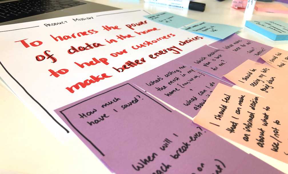
Product mission statement and four underlying pillars, which map out all-encompassing components that should ultimately achieve the above mission
Next, we identified users and mapped out their emotional journey. This helped the team visualise exactly how we can drive customer behaviour by understanding their thoughts and feelings and actions.
Finally, we defined key user flows to scope and guide design exploration and decision making, to be used later in the design sprints.
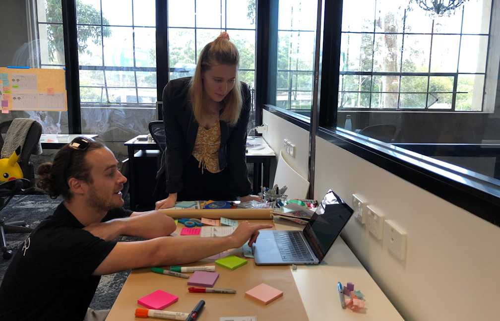
Six design sprints were conducted throughout the project, aligned to the 4 sections of the app and 2 new features.
Each sprint started with a discovery phase - understanding this week’s deliverable by asking our experts (the product team), conducting individual comparative analysis research and then sharing these during our lightning talks.
Flowing with ideas and inspiration, we took some time to sketch and explore concepts individually.
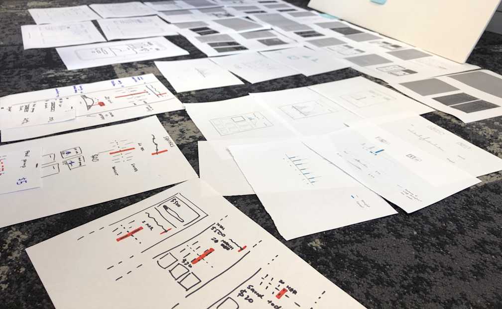
Sketches were then displayed for everyone to see so that the team had time to take in all the ideas and concepts. It’s always interesting to see what everyone imagines in their head, and how differently it can manifest on paper.
After a quick round of dot voting and discussion, the team is usually more aligned on the concept - where we get to see which elements or features people liked and why. In the cases where there was a bit more tension than unity - since everyone is very passionate about this product - it was always important for everyone to feel heard and understood. Ultimately, the decision belonged to the Product Owner, who would settle on a direction.
In preparation for the week ahead, we selected specific elements that we wanted to test with users, creating a rough plan of the testing session. This included piecing together sketches into a storyboard, as a guide for prototyping.
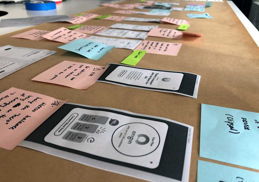
As data was such an important part of the app, we worked together with the data analysts and developers to source real data for the prototype - which also brought up discussions of any outliers or edge cases that we needed to consider in our solution.
I led the team in designing the prototypes, using Figma and their existing design system. The goal was to create a representational experience within the limitations of our static data and set user flow.
We had the additional challenge of iterating on these designs simultaneously with the following sprints, as these final designs needed to be handed over to the development team throughout the project. I worked within these constraints to transform disconnected prototypes into high-quality designs that create a seamless experience for the user.
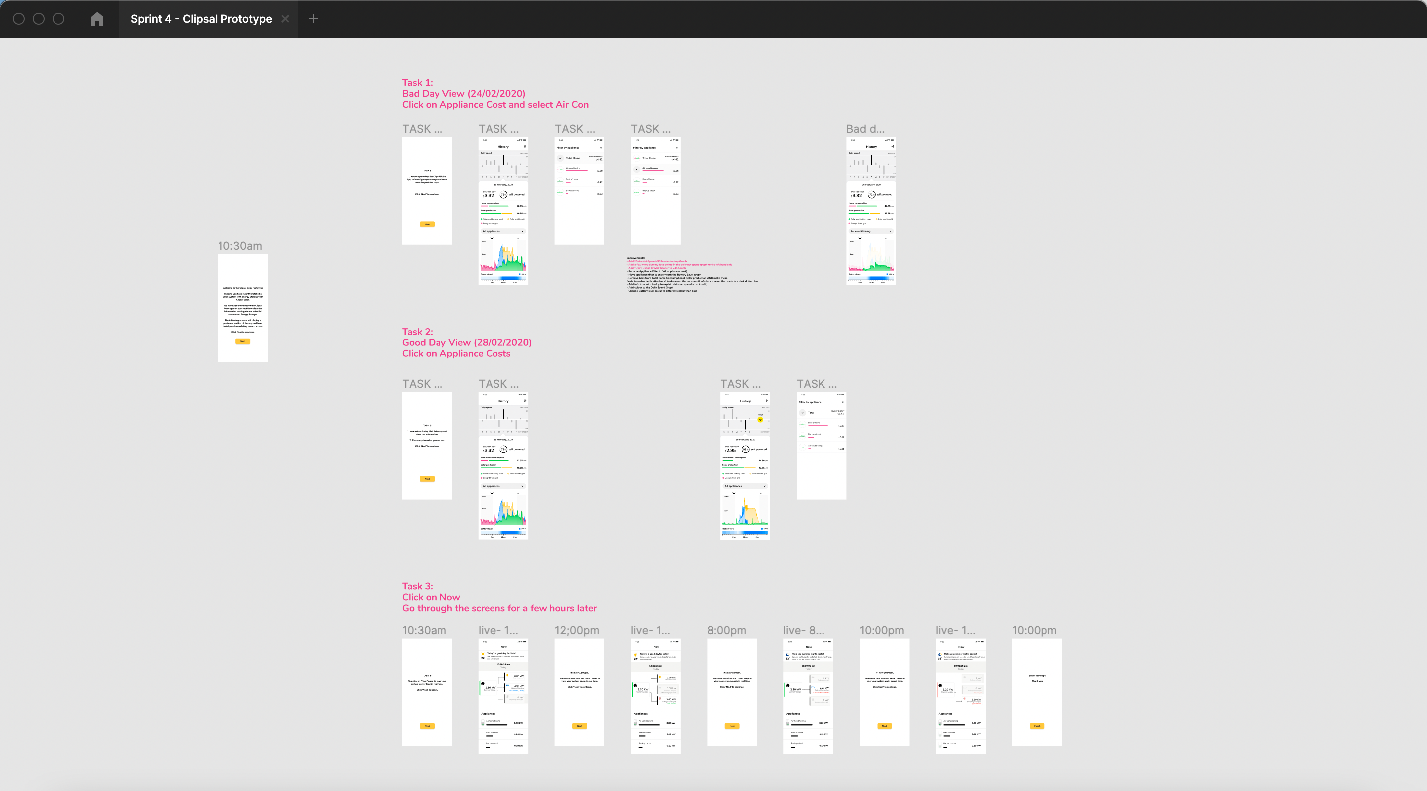
Since the product owner had an established relationship with the customers, he conducted the user testing sessions. We would set up a pilot test on the day before, to catch any prototype or script issues.
Before this project, user sessions tended to be more casual, however, we pushed for a more structured and focused script. Throughout the design sprints, the team saw the value of these as we received more targeted and actionable insights.
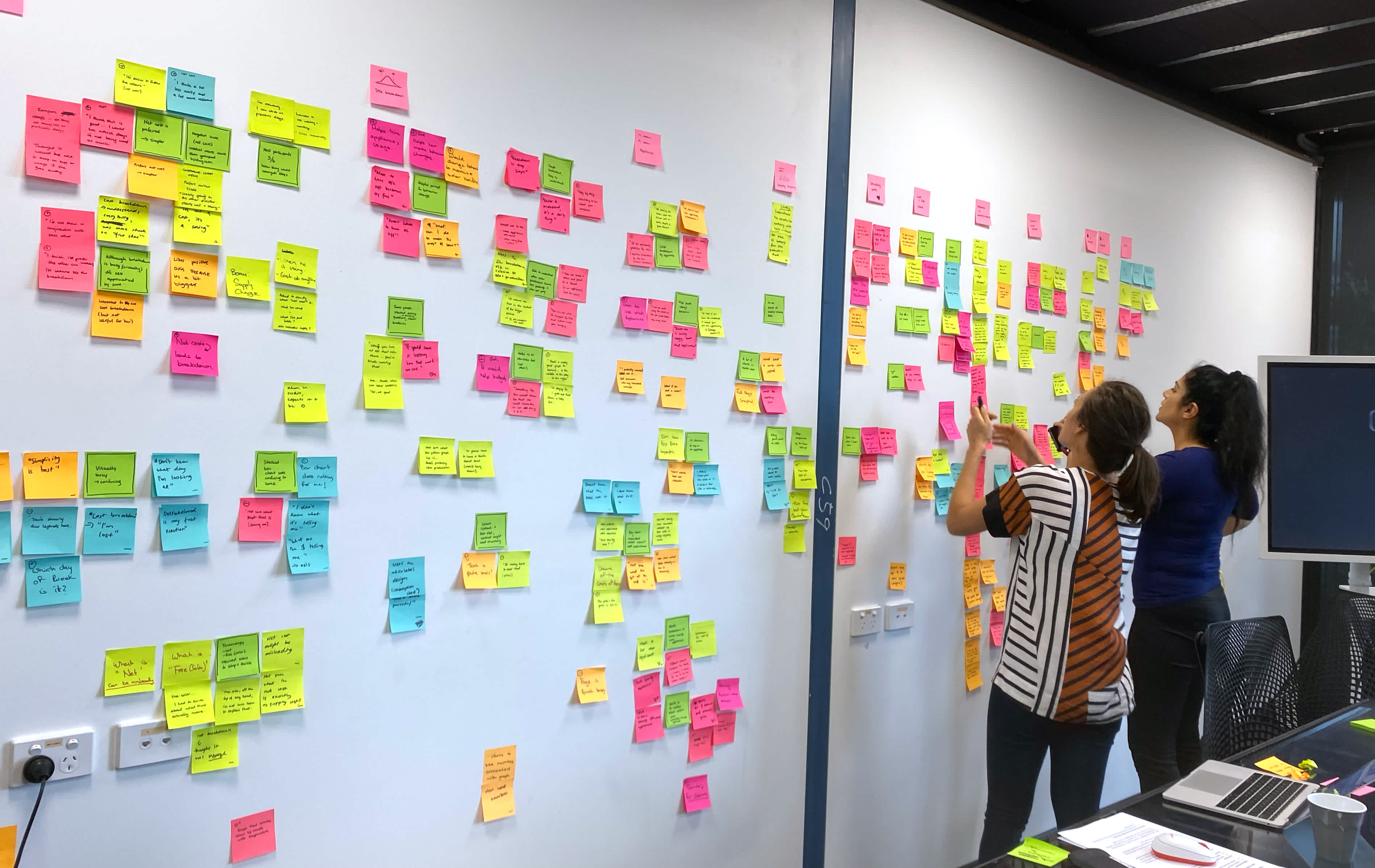
During the interview sessions, we used a live synthesis approach to simultaneously collect insights and organise these by user, task, feature and emotion. This was immensely successful in efficiently pulling out the key insights and informing design decisions - all in the same afternoon.
Solution
An innovative, comprehensive and trusted mobile app - with an average rating of 4.7 stars on the App Store. The app has more than 500 users, who saved about $700k to date.
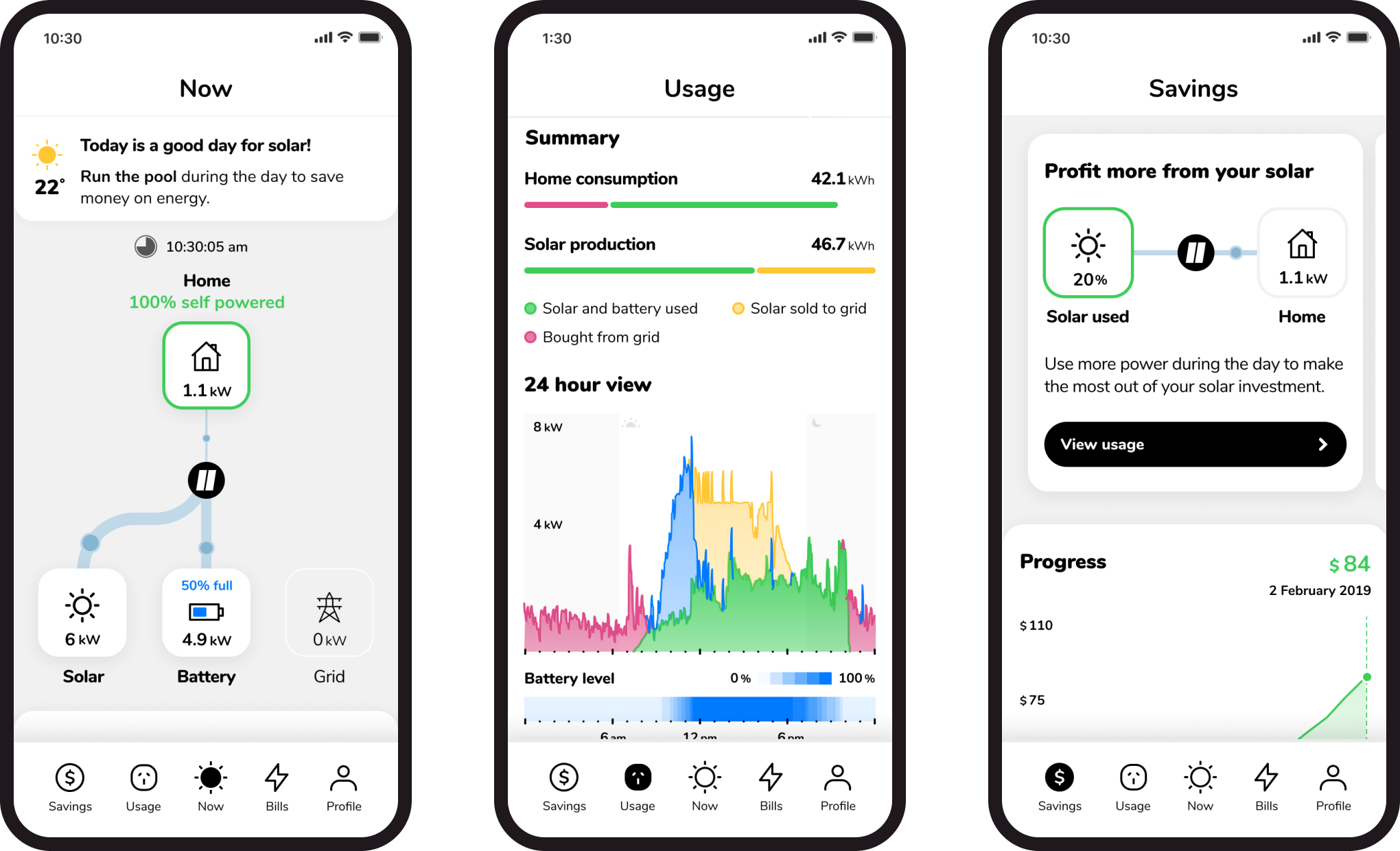
The Pulse app empowers homeowners by giving them instant access to their solar generation and energy consumption data. Customers now have a better understanding of exactly how their daily behaviour affects their electricity bills. As a result, customers have said that knowing where their energy goes allows them to make simple changes - such as turning off the heat lamp - to dramatically save costs.
