Back to all projects
Trip Planner
Product Design
Luxury Escapes is an online travel agency, specialising in sourcing all-inclusive 5-star luxury deals directly from the hotel to the customer at the best price. It has since expanded from a simple list of hotel offers to more comprehensive, all-inclusive travel products, including flights, tours, cruises, and experiences. Trip Planner brings together the unique offering of Luxury Escapes as tailored suggestions designed to help the user build out their trip one step at a time.
My Role
I lead the product design of Trip Planner, from the initial concept all the way through to design and launch. During my time on the project, I worked closely with UX research, product and engineering.
My main contributions were:
Conducting competitor analysis and running ideation sessions
Creating user flows based on existing personas and user research
Evaluating effort and impact of proposed features with the team
Contributing to the product roadmap and helping identify priorities through a user-centric lens
Converting my sketches into high-fidelity prototypes and visual designs
Contributing to the global design system in Figma
Developing interactive prototypes to be used for usability testing
Collaborating with UX research to synthesise results from usability testing into valuable insights
Collaborating with engineering to test and iterate on developed solutions
Problem
Planning a trip is a complex and time-consuming task for Luxury Escapes customers. It requires a lot of effort on the user’s behalf and can be overwhelming with the amount of choice available across hotels, flights, tours, cruises, and experiences.
Whenever customers needed help in planning their trip through Luxury Escapes, their only option was to call customer service, receive a quote, and then call back to make a purchase. This process increased call wait times overall, and also couldn’t address every aspect of trip planning either - such as booking restaurants, visualising a trip itinerary, or even sharing their booking with fellow travellers.
The goal was to remove these barriers, allowing customers to self-service their own needs as well as increasing the scalability of our products.
Process
Planning a trip is hard. Really. On the surface, it’s exciting and gives you something to look forward to - but as you sink deeper into the nitty gritty details, it can become overwhelming, stressful, and very complex. The challenge for me was to understand, define and map out the following complexities in order to design a comprehensive solution:
What makes up a trip?
What’s the motivation for going on a trip?
How do users plan and book a trip?

Mapping out each part of trip planner to cover the entire user journey - from discovering destinations, planning the trip, booking and then finally travelling.
1. What makes up a trip?
What even is a trip? To some, it’s 6 weeks backpacking through Europe, while others prefer to relax for a few days on the Gold Coast. Or maybe even go skiing in New Zealand. Or perhaps trying all the food in Singapore. Every trip is unique, and we like it that way.
While most of the Luxury Escapes deals are designed to be single destination trips (think Bali, Maldives and Fiji), 38% of customers surveyed after checkout have actually booked hotels in more than one destination for the same trip.
This suggests that while we do need to cater to the majority who just want to go to a single destination, it would be amiss to ignore a large proportion of our customers who want to visit more places. Solving this problem could also lead to an increase in high-value, multiple-destination trips planned through Luxury Escapes.
The structure of a trip was actually one of the biggest challenges in this project, as different types of trips required vastly different hierarchical structures for optimal use.
For example, let’s take a pretty standard Maldives trip and compare it to something more complex like a Europe trip (from the point of view of an Australian customer).
A Maldives resort offered on Luxury Escapes is typically all-inclusive, with dining and even airport transfers included all in one package. Even the return flight can be added on - everything is made simple for the user because the choices are limited.
A European trip is already more complex, as this typically involves multiple destinations - which results in many more choices for the user to make in terms of hotels, flights, dining options and things to do in each location.
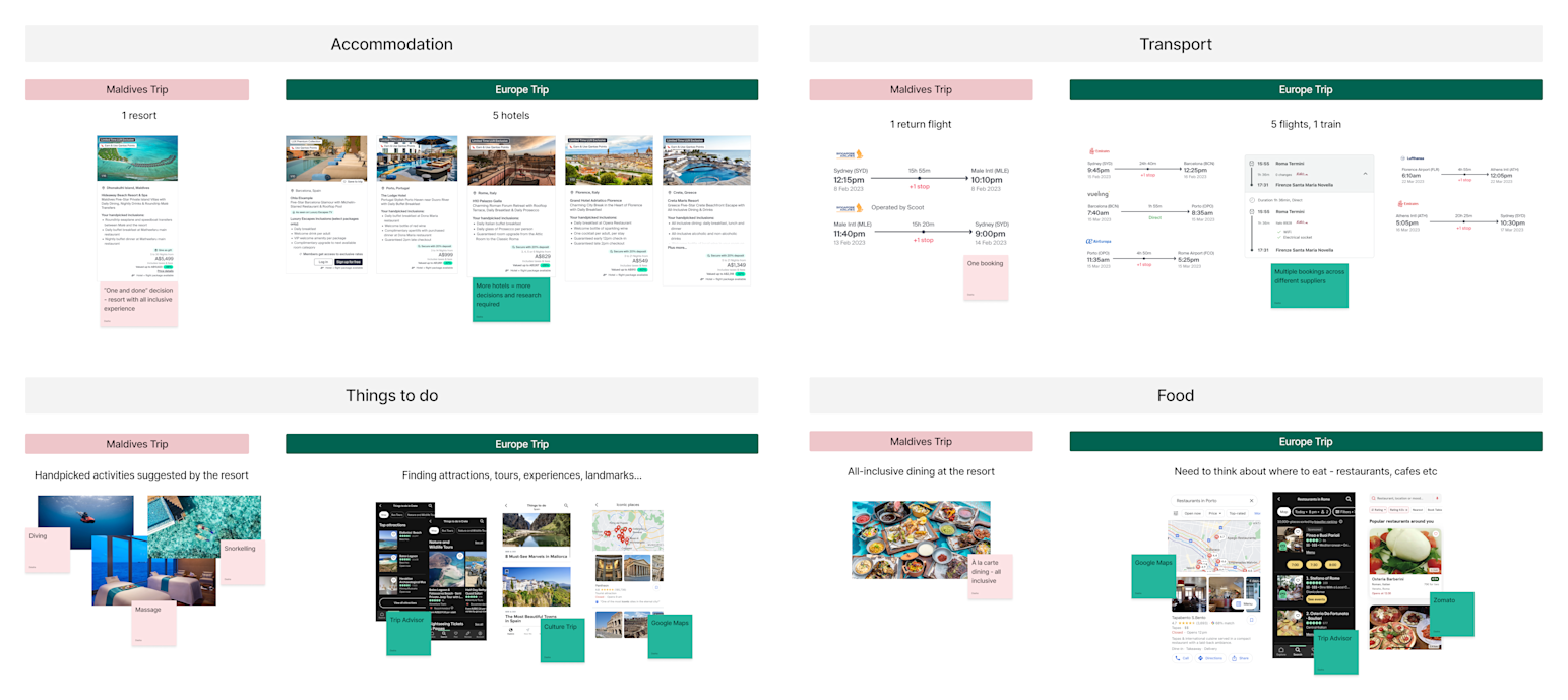
Taking these two vastly different trips, my hypothesis was that the multi-destination trips would benefit from a hierarchy that would nest all items under it’s related destination, while single destination trips could be “flattened” out to show all items in a simple list.
Before I could get started experimenting with trip structure, I needed to investigate how all the individual trip items work together. My approach to this problem was to use real-world trips and map these out as trip itineraries. This allowed me to understand where Luxury Escapes products fit in, and also where the gaps were - for example products that we just didn’t sell yet (e.g. car rentals), or the items that the user has already purchased elsewhere (e.g. Airbnb).
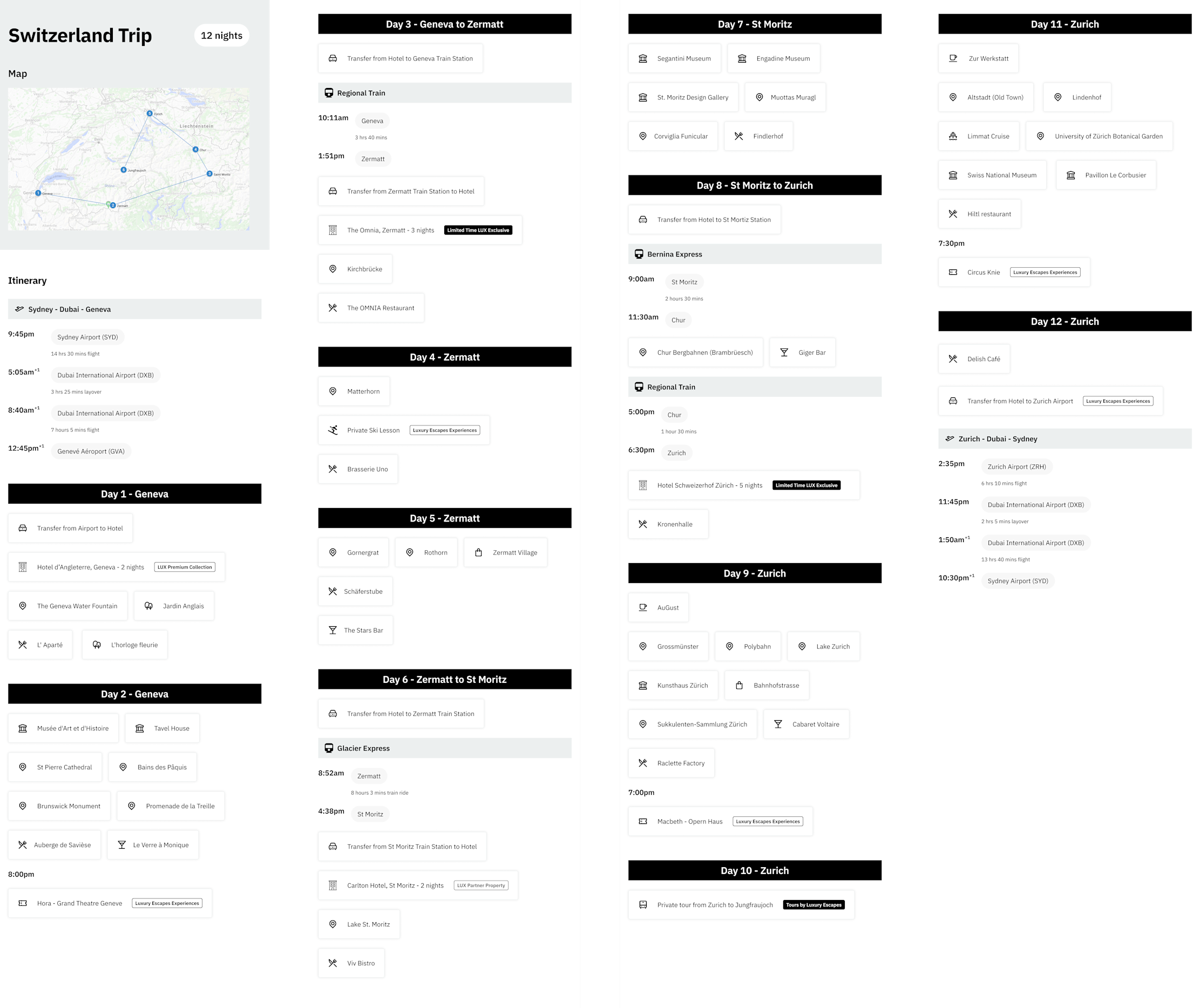
Switzerland trip daily itinerary - including hotels, transfers, activities and restaurants
Using these trips as a starting point, I was able to narrow down those building blocks of a trip, specifically:
Accommodation A place to stay, whether that’s a hotel, home rental or even someone else’s house.
Transport A way to get from your origin to the first destination and back, as well as any destination in between. For most Luxury Escapes customers this would involve flights.
Transport could also include getting around within a destination, for example trains, buses, ferries, taxis.
Restaurants Pretty much any place to eat or drink.
Things to do Whether it’s a famous landmark, or a popular activity in the area, it’s something to fill up your day.
Tours and cruises A guided experience that spans multiple days and usually has accommodation, transportation and dining included all in one.

Initial sketches for key trip planner screens

Key wireframes developed from previous sketches, from discover and plan to book and travel phases
2. What’s the motivation for going on a trip?
What drives us to go somewhere? To escape, unwind, experience ultimate adventure, or even visit family and friends. The whys can be endless, but that motivation becomes an important factor in knowing what the user needs to accomplish from a tool like Trip Planner.
Initial discovery was conducted, including focus groups and surveys to identify specific pain points during planning, booking and travelling. Overwhelmingly, finding the right destination was the number one pain point for users. They struggled to find quality travel information, including:
Where to go? (Destination, hotels, places of interest)
When is the best time? (Seasonality, cost, tourist peak)
What to do there? (Suggestions for restaurants, experiences etc)
From here, I conducted a competitive analysis to understand how other trip planners solve similar issues. Main insights I gathered were:
It’s not just about making the planning part easier - it’s also about inspiring the user with suggestions and guides. This is what sets a trip planner tool apart from conventional methods such as excel sheets.
Take it one step at a time - users don’t plan their trip in one sitting, and we shouldn’t force it. Any prompts should be timely and well considered, e.g. don’t show me hotels when I’ve already booked an Airbnb.
Complex parts of the trip (such as itineraries) should be visualised with simplicity - using maps and calendars to help users understand the structure.
(Mostly) everyone shops around - don’t expect customers to buy everything in one place. Empower them to bring their entire trip to you.
Encourage collaboration - allowing users to share their trip with fellow travellers makes the planning process seamless
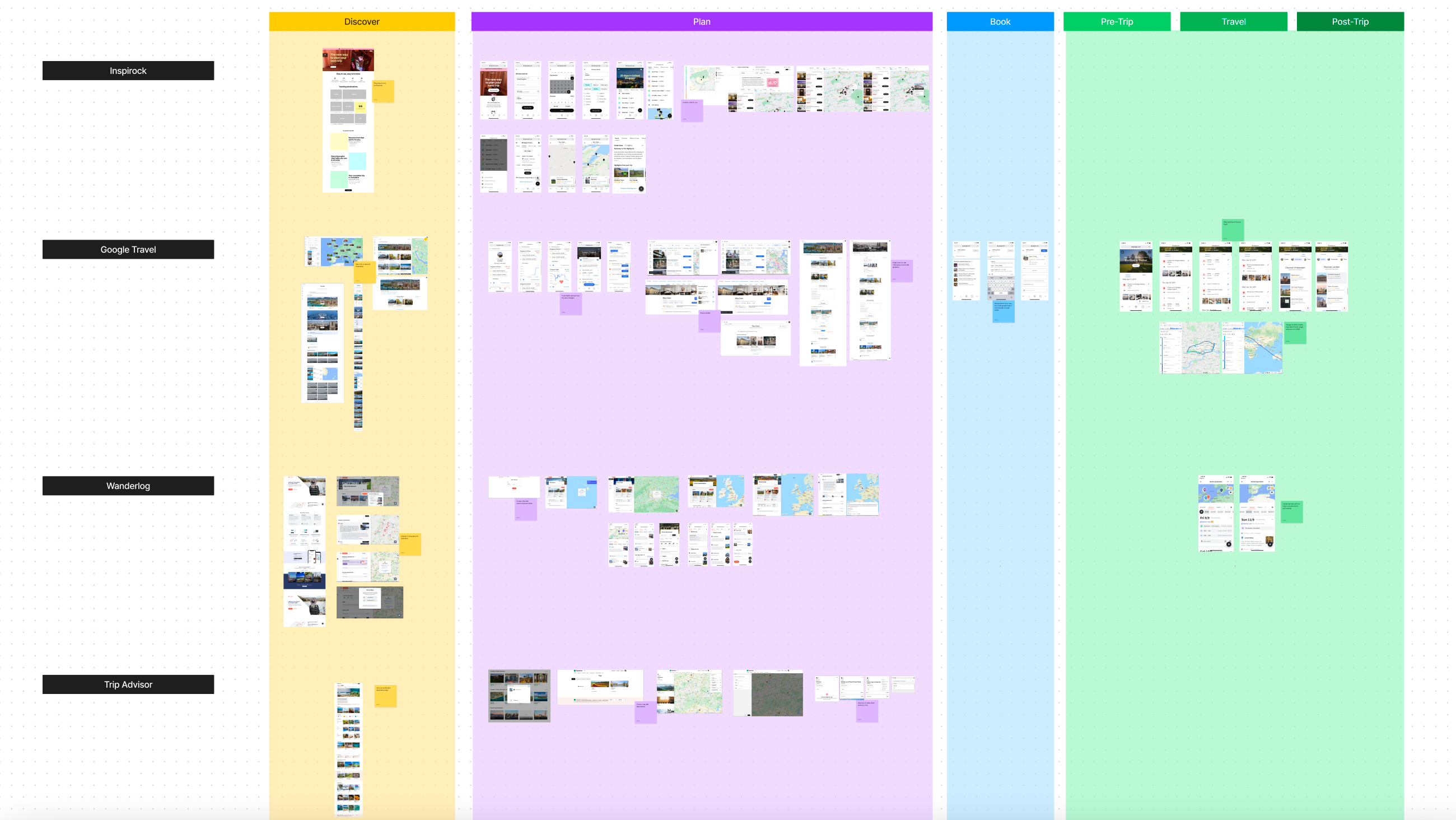
Competitor analysis, organised by features in each step of the trip planning journey
One very important aspect to consider was how Luxury Escapes as a product differed from all other trip planners. The structure and flow of the existing website meant that users had developed a particular way of browsing and booking offers. Even though Trip Planner was envisioned to be the “glue” that would tie all parts of the website together - from saving offers, to planning a trip and booking - I needed to understand exactly how that would look like.
While uncommon for other online travel agencies, browsing by the top offers has been the main source of revenue in the past. Even though the flow sounds quite simple, the amount of choice available for customers (e.g. deals, rooms, packages, options and dates) to actually get to the booking stage means that the complexity increases exponentially.
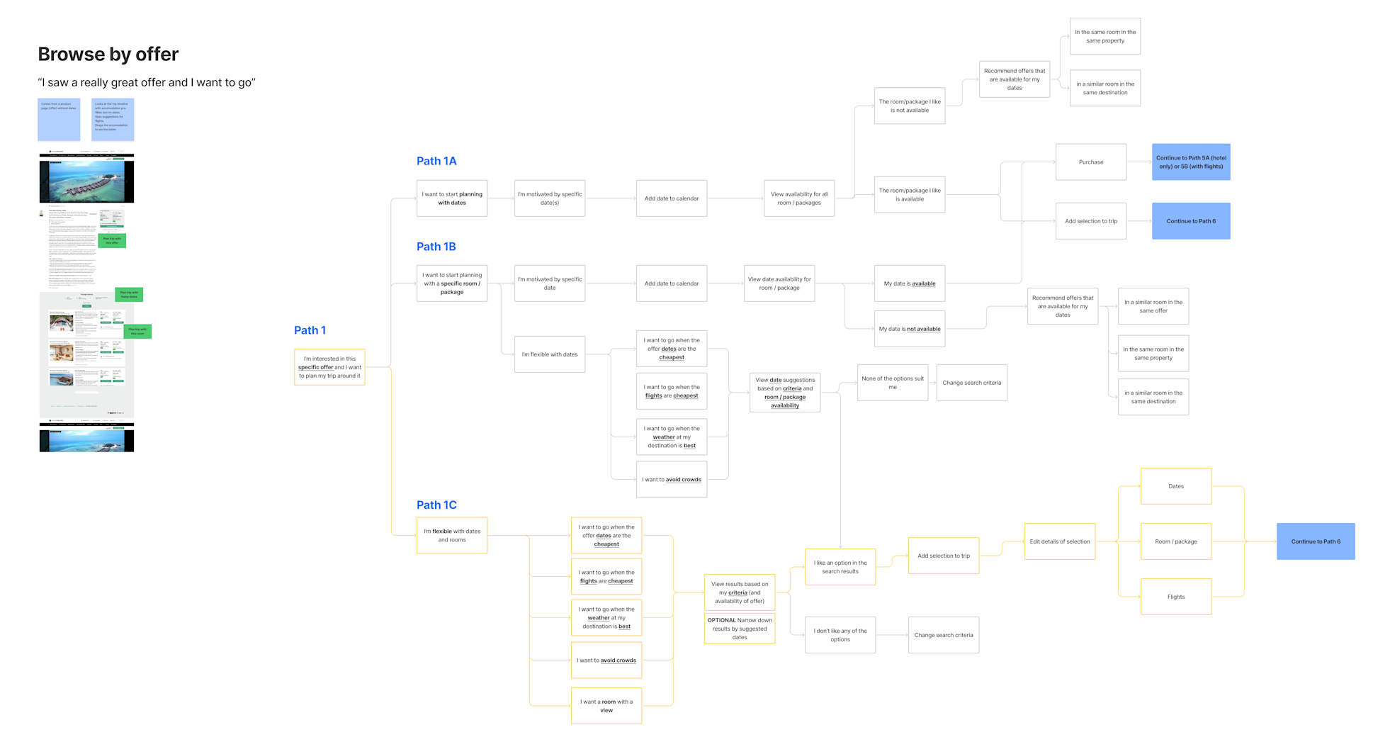
Browse by offer - “I saw a really great offer and I want to go”
Searching and browsing offers by destination is a relatively new feature for Luxury Escapes, having only been implemented in the last few years. However it’s one that continues to grow, as users are inspired to go to a new destination or want to return somewhere they’ve already been. It’s about knowing where you want to go, and wanting to be inspired by the offers available in that destination.
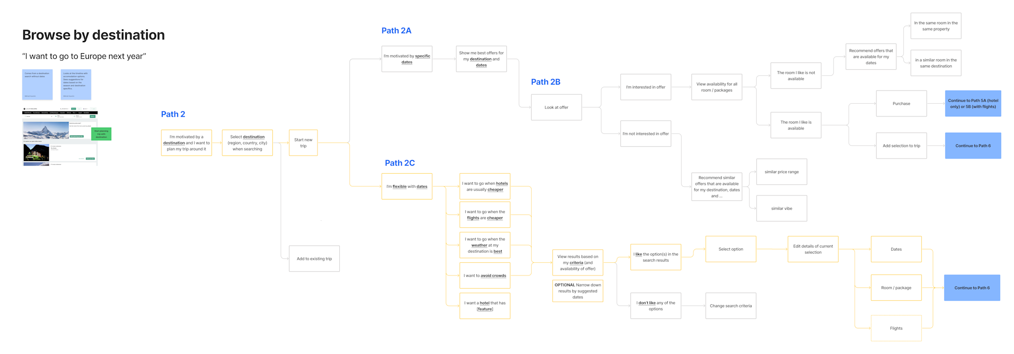
Browse by destination - “I want to go to Europe next year”
It was becoming apparent that Trip Planner can evolve to become a powerful tool with many complex features. The challenge I faced was advocating for the user’s needs and goals while taking into account the vision of stakeholders and executives who were heavily invested in this product. It was always about relating the feature request back to the main user need or pain point, or even testing with real users to understand how they perceive a particular aspect of the tool.
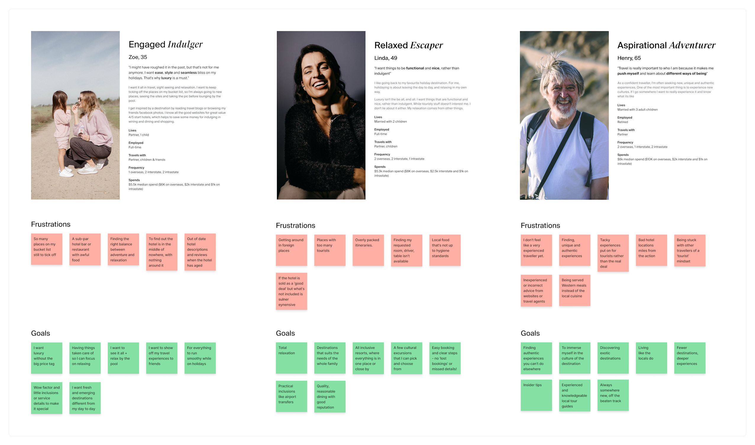
Key user personas for Luxury Escapes
3. How do users plan and book their trip?
In short, everyone plans their trip differently. Some prefer to use a travel guide and a notebook while talking to a few friends. Others religiously scour travel sites, build intricate spreadsheets and have at least 100 tabs open full of inspirational ideas.
From a 2020 survey of 500 Luxury Escapes customers, 4 in 5 haven’t used any specific trip planning tools previously. Instead, most (76%) used Trip Advisor for travel research, while collaboration with travelling companions was mostly email (43%), text message (27%) and phone calls (25%).
Therefore it was not only a case of competing with existing competitors, but also converting customers who did not previously see a need for a trip planner tool.
At this point I worked together with the UX researcher to put together a usability test. The goal was to understand how our existing and potential customers would use Trip Planner, specifically when creating a new trip. I wanted to understand how they plan a trip currently, and then ask them to complete a few simple tasks using my interactive prototype. During this process I also wanted to uncover any elements of confusion or struggle.
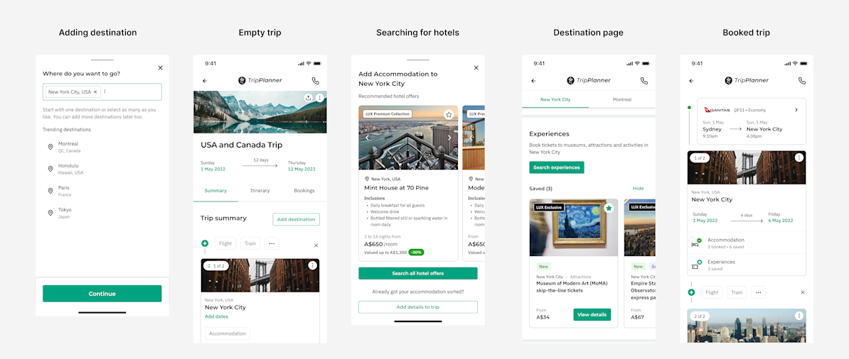
Key screens from the interactive prototype used in the usability testing sessions
The overarching insights gathered were:
Users were split into two types of travellers:
“Researchers” - those who know exactly where they want to go even before they start to plan their trip
“Explorers” - those who need inspiration during the planning process as well as suggestions on the specific places to go, things to do and where to stay etc
Users only actively start planning a trip when they have an idea of when and where to go - that’s when a trip becomes “real” to them
Most had a destination in mind, even if it was a broad region or country, for example Europe or USA.
Most were aware of their own preferences for trip dates, and would typically start planning with a date range in mind. This could be the seasonality of the destination, their own availability or even the price of flights at the time.
As expected, most never used trip planning tools before. Each user had their own unique “system”, which could involve a variation of emails, excel sheets, printouts and maps.
However they were pleasantly open to exploring a new tool, and rated the prototype an average of 7.8/10
The number one request was for more inspiration around destinations, as the users expected something more in return for adding a destination to their trip.
For example they wanted specific suggestions for restaurants and attractions in the area
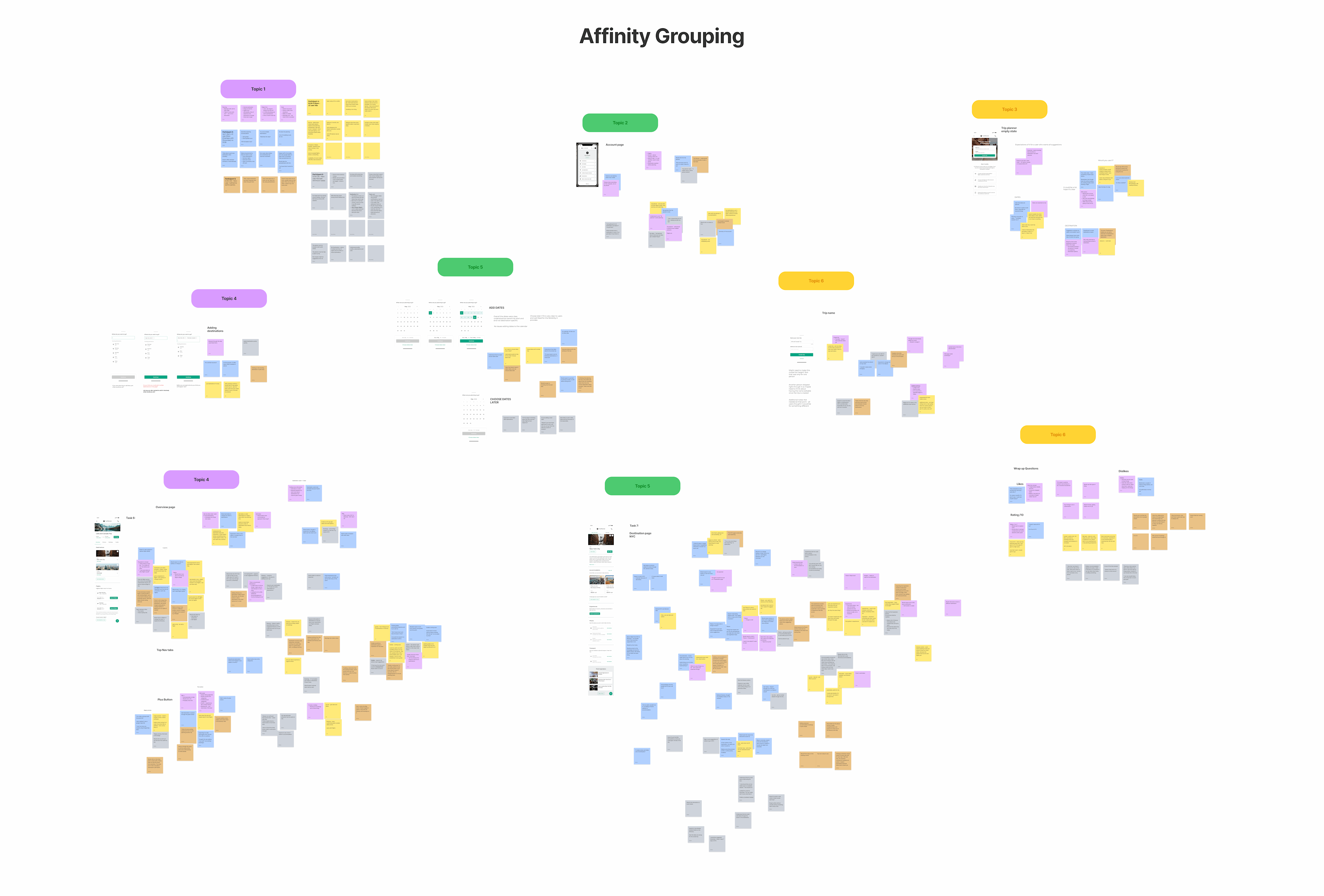
User testing results grouped by insights, colour coded by participant responses
Bringing it all together
The goal of Trip Planner was to always nudge the user towards their next step in the process, whether that be to discover something new or import a booked item. This allows them to self-service their own needs in an easy and efficient way, while also surfacing relevant products to enhance their trip.
Even in the empty state, the “gaps” of the trip (e.g. hotels, flights, things to do) are visualised either through prompts or suggestions. Users can always access a way to add something to their trip, whether that be a Luxury Escapes hotel, an external booking or even just a custom item like an attraction.
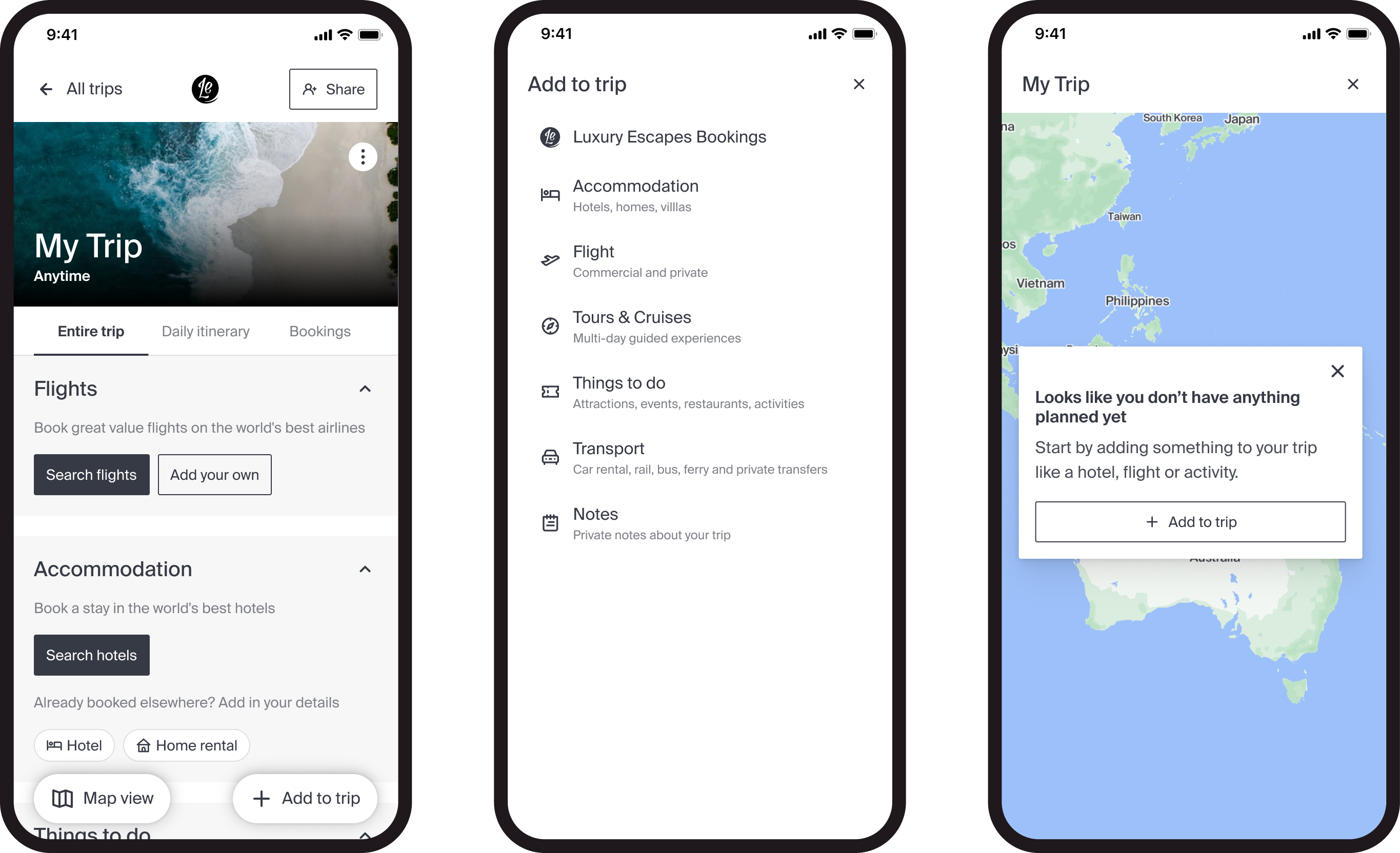
Luxury Escapes products have grown to encompass not just hotels and flights, but also experiences, tours and cruises. There was always huge potential to bring all products together, and with Trip Planner it was finally possible.
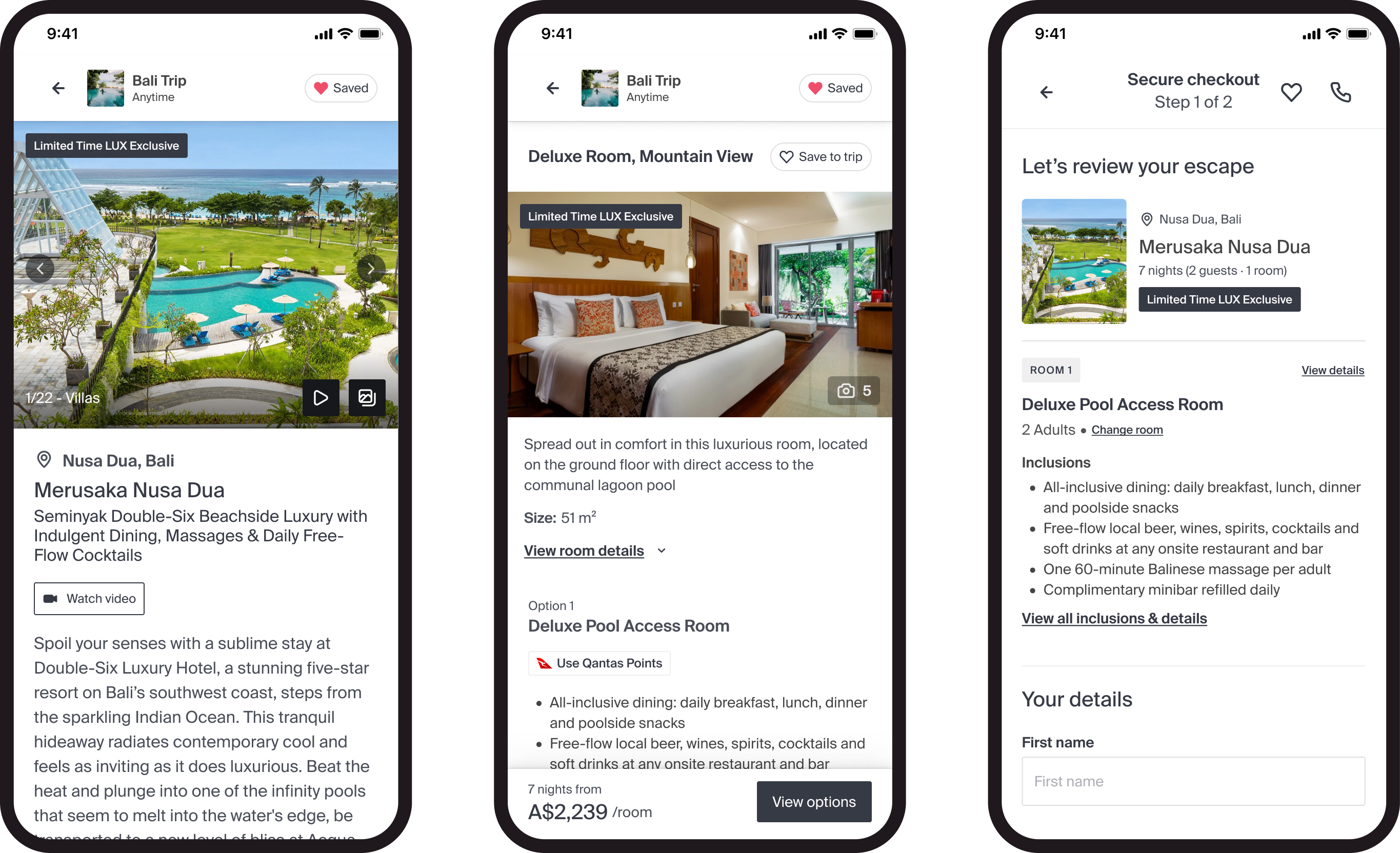
Users can now save any offer to the trip, making it easy to keep a collection of potential trip items which will automatically be organised inside the trip. I recognised that it was important to save not just the offer itself, but also any user preferences (e.g. dates, rooms, packages etc). This would allow users to incrementally make decisions about the trip, which in turn makes the planning process easier.
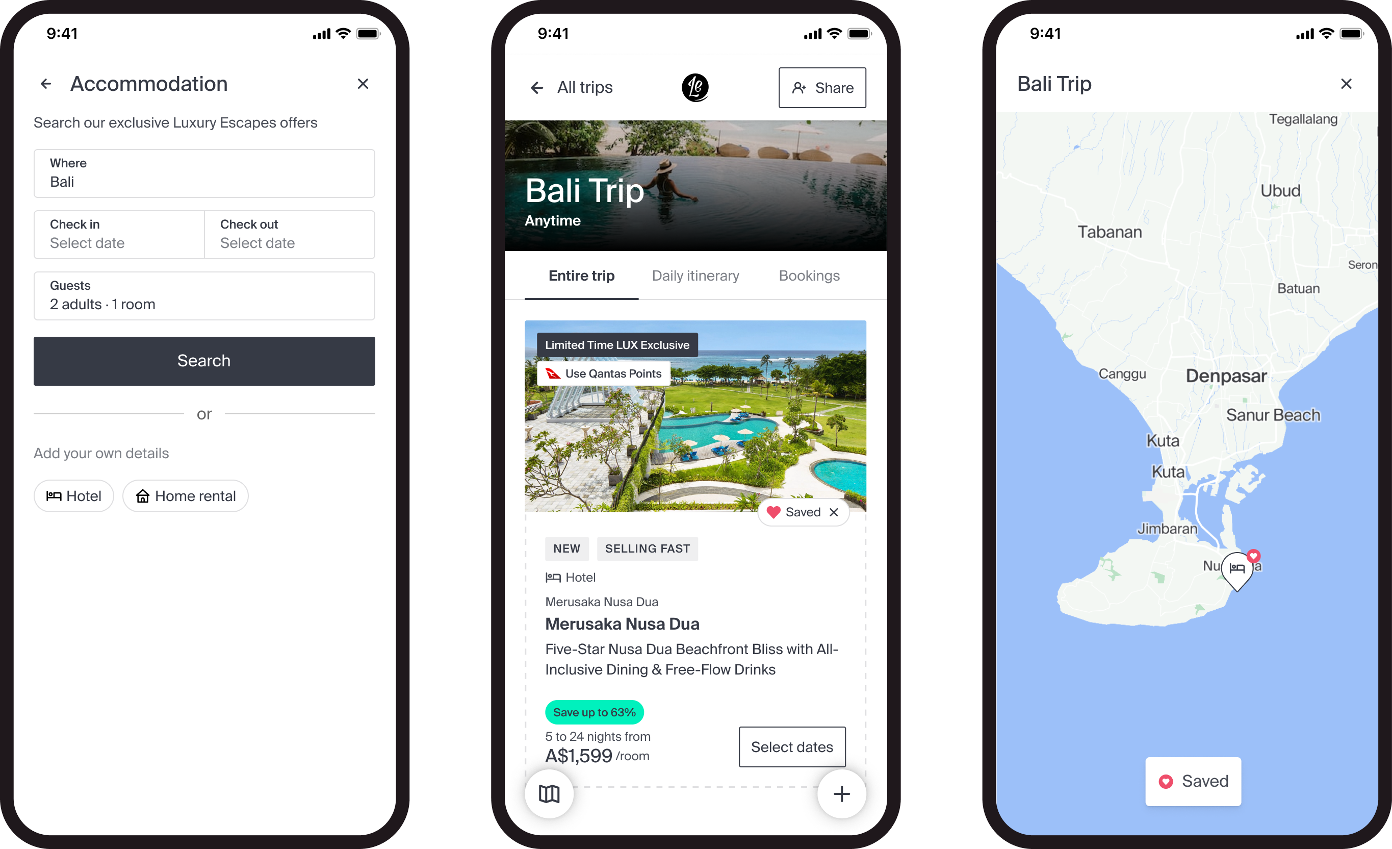
However, one challenge I encountered early on was the disconnection between Trip Planner and the rest of the Luxury Escapes website. While it was easy to save offers to a trip initially, it was harder for a user to make changes to their saved offers (e.g. changing dates, swapping rooms) or even progressing to booking the offer (which would previously take them out of the trip).
My solution was to introduce an immersive browsing mode which allows users to keep planning within the context of their current trip. The browsing and booking experience was kept the same as the rest of the site, with the addition of a “trip header”. This header reinforced the idea of planning with their specific trip - as it was always in view - and also had the bonus of creating shortcuts for the user (e.g. saving an offer and changing preferences at any point).
In the example below, a user can search for hotels directly from Trip Planner, save as they go, make changes that will be automatically updated and then continue to checkout to purchase the offer. Post-purchase they are taken back to the trip where they can immediately view their booking, as well as tailored recommendations for “missing parts” of their trip.
As discovered during user research, customers want more inspiration around their destinations as well as specific suggestions.
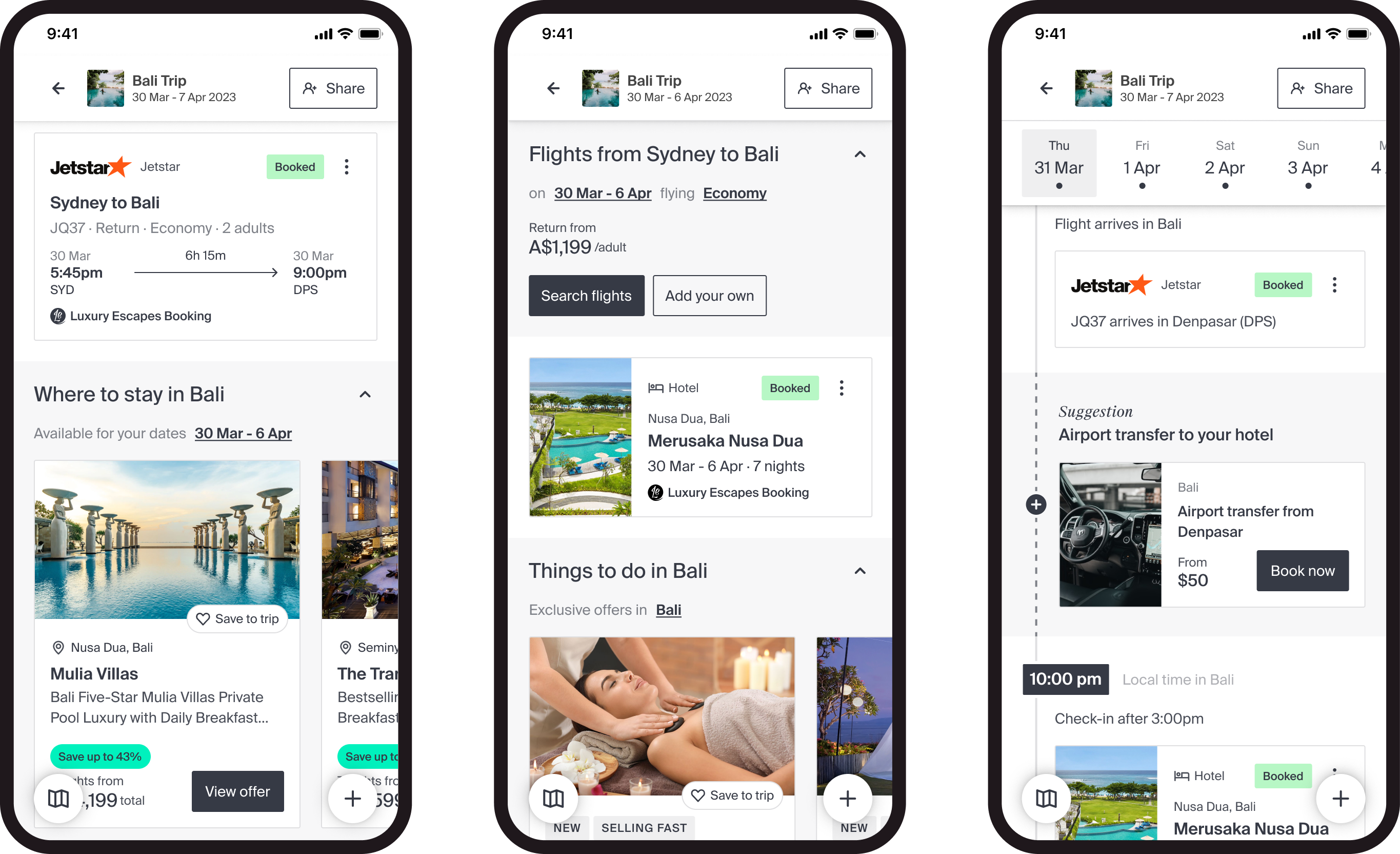
By using a combination of existing machine learning and smart search queries, we could surface relevant and timely recommendations to the customer within their trip. Based on the location and date/time of existing items within their timeline, we can know when and where they will be - so we can scour the products we have available to push to the customer.
For example, if a user has already bought a specific return flight (e.g. Sydney to Bali) we can already surface hotels with the best deals that are available for those exact dates in Bali. Conversely, if a user has purchased a hotel first, we can suggest they search for flights with their dates and origin location (derived from their IP address) already pre-filled, with an indication of how much it can cost as well. This logic also extends to other items such as things to do or even transportation (e.g. airport transfer to the hotel).
These suggestions can fill the gaps in the user’s trip itinerary, as well as prompting the user to keep building out their trip.
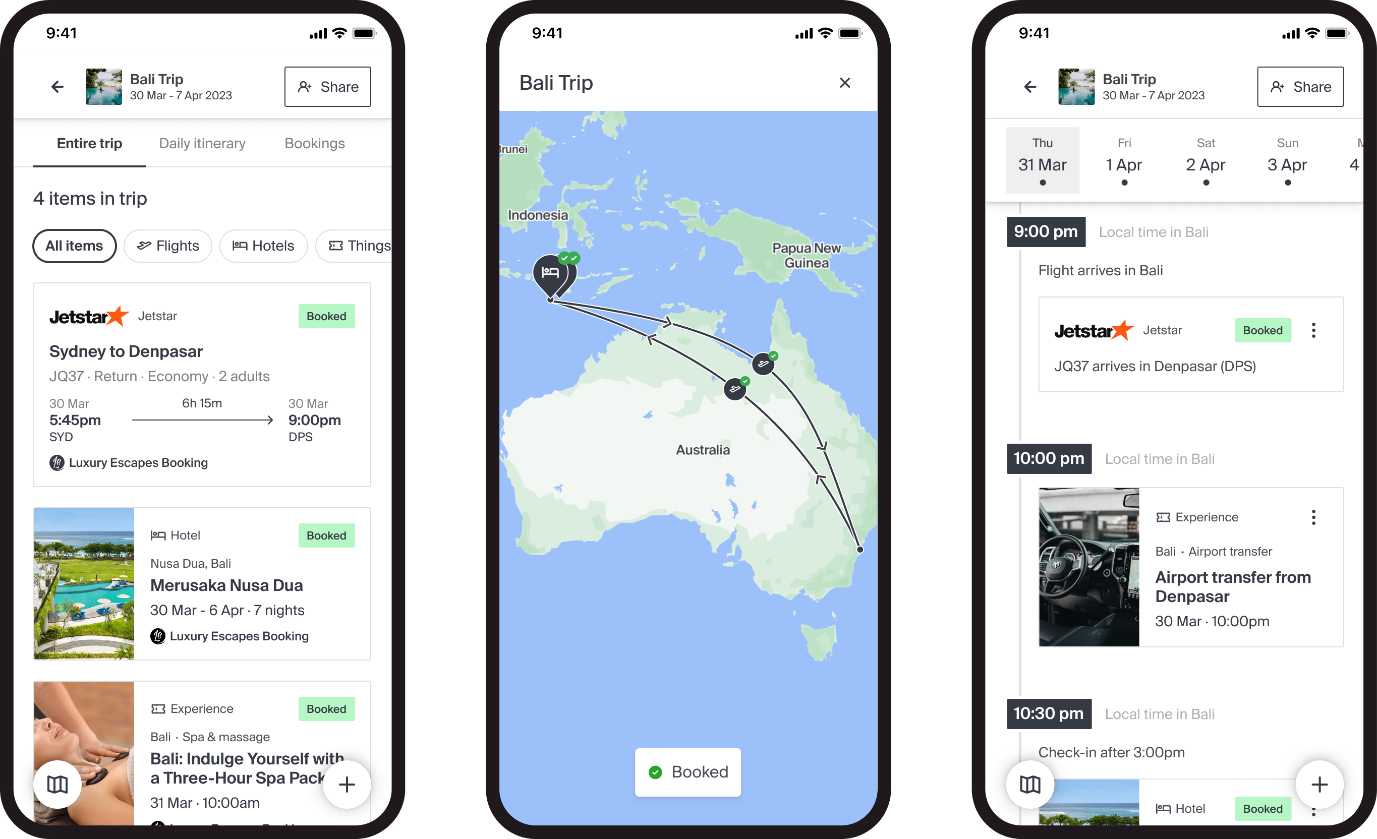
Another insight we gathered from user research is users have specific and preferred ways of planning their trip. Some users are more detailed oriented and love to see the day-by-day, others prefer keep a high level view of all their bookings, and some can spend hours looking at a map.
My challenge was to both cater to the needs of the users but also optimise their planning experience when possible. The final solution encouraged the user to switch between multiple views depending on their stage in planning, booking or travelling.
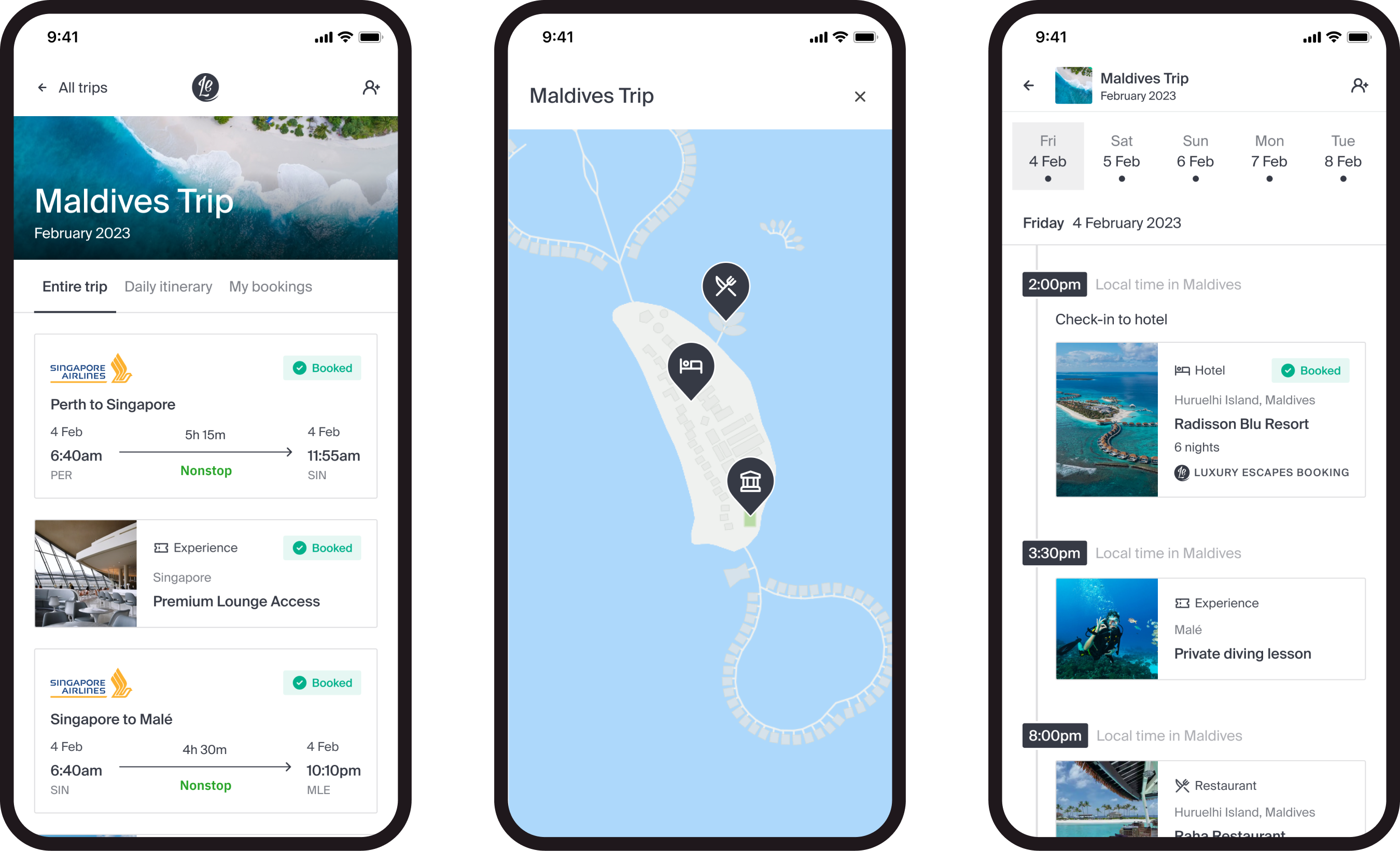
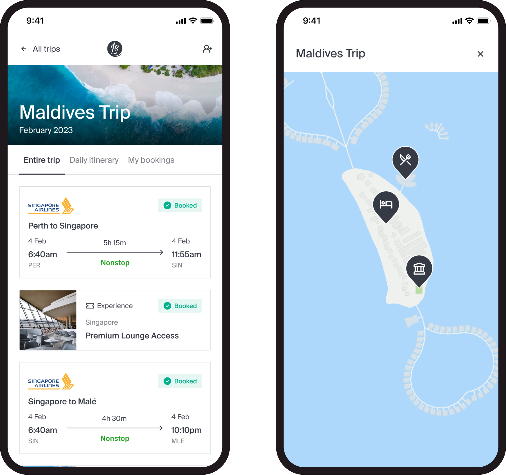
Entire trip - presents an overview of everything in the trip, whether it’s a potential item without a date or time, or even something that has been booked already
Daily itinerary - visualises any trip item that has a date and time which allows the user to plan out each day individually
Bookings - list of all bookings that have been made on Luxury Escapes (or elsewhere) with the associated cost, so that users can quickly view details or make any amendments
Map - geographical representation of every trip item with a location, with a visualised route for each transport item (e.g. flight path between airports)
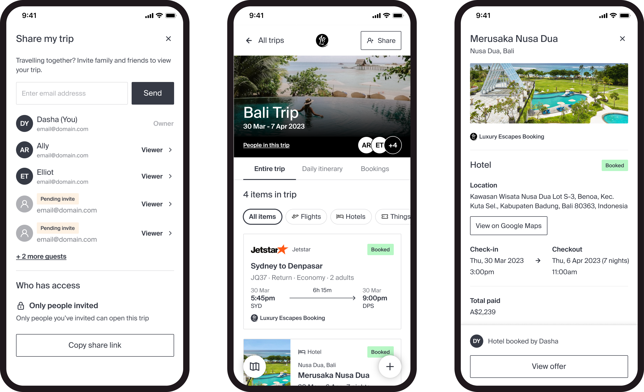
Couples and families make up a large portion of the customer base, and so it makes sense that the trip planning experience also includes those peripheral users, in addition to our primary Luxury Escapes customers. Sharing a trip was actually the top requested feature by users who tried out the first MVP release of Trip Planner in mid 2022.
The main challenge that arose with trip sharing was the ability to not only see someone else’s trip, but also to edit and contribute. During my research at the time, very few trip planners allowed someone else to both access and edit the same trip.
When designing I had to consider the state of each trip item, whether it had any private information as well as the available next steps to an editor or viewer. For example, a user can create a shared trip with their partner for their upcoming honeymoon. Both are able to contribute by saving hotels and flights, adding restaurants and even booking offers. They should be able to see everything (including booking information) and have equal access to the trip.
On the other hand, another user may want to share a trip with a family member to let them know of their travel plans, but as they are not travelling together they don’t need to view any booking information or make changes on their behalf.
Both use cases present vital flows for trip sharing, and while the viewer only option has already been released in late 2022, editing capabilities will be a fast follow in 2023.
Solution
Trip Planner is a fully integrated web app that simplifies and enhances the experience of discovering new destinations and offers, starting a trip from scratch or importing a booking, as well as planning the entire trip - all in one.
Trip Planner has further challenged existing user experience and implementation - as a result propelling the entire product line into rapid iteration and constant improvement.
In a month since the product was fully launched, tens of thousands of trips have been created by customers all over the world. In those trips, more than 95% of all items were Luxury Escapes offers, signifying that Trip Planner has integrated seamlessly into the rest of the product line. In the same period there has also been an increase in revenue that can be directly attributed to Trip Planner.